Cinematic Travel Editing in Lightroom — Complete Guide (2026)
Cinematic Travel Editing in Lightroom — Complete Guide (2026)
Cinematic travel photography has a specific quality that separates it from ordinary holiday snapshots: intentional color, atmospheric depth, and a consistent visual identity across varied locations and lighting conditions. The cinematography reference is accurate — the best travel photography looks like individual frames from a film rather than a record of places visited.
This guide covers the exact Lightroom approach to cinematic travel editing — the workflow, the adjustments per scenario, and the specific settings that give travel photography its most compelling quality.

What cinematic travel editing actually means
Cinematic does not mean dark and desaturated. It means the color and tone have been deliberately shaped to feel like a world rather than a document. Three specific qualities define cinematic travel photography:
Tonal intentionality. Highlights are protected, not blown. Shadows have warmth and depth, not digital black. The tonal range has been shaped — not just exposed correctly.
Controlled, muted color. Cinematic color is never vivid. Vibrance is reduced, Green Saturation is controlled, Blue is deeper rather than cyan. The result is rich rather than bright.
Consistent character across locations. A great travel feed looks cohesive from Paris to Morocco to Japan. The same preset approach calibrated per local light creates this — not identical settings but a consistent color philosophy.
The cinematic travel workflow
Step 1 — Camera Calibration first
Camera Neutral (Canon), Camera Standard (Sony and Nikon), matching film simulation (Fujifilm). This step flattens the camera's own color processing and gives the preset a neutral foundation to work from. Skipping this step means two different color interpretations stacked on top of each other.
Step 2 — Exposure and tonal foundation
Exposure: 0 to +0.2 for outdoor daylight. -0.1 to -0.3 for moody indoor and night scenes.
Highlights: -40 to -55. Cinematic photography has no blown highlights. Pull aggressively — especially on bright travel subjects like whitewashed architecture, sandy beaches, and bright skies.
Blacks: +15 to +22. The lifted shadow floor is the film quality foundation. Pure black looks digital.
Shadows: +10 to +18. Open but not airy — cinematic travel has depth in the shadows.
Contrast: -12 to -18. Remove the digital contrast baseline. Organic contrast comes from the Tone Curve, not the Contrast slider.
Clarity: -8 to -10.
Step 3 — Tone Curve
The cinematic S-curve is more compressed than the standard film look:
Bottom anchor: lift 14-16 units. Point at 28%: nudge down 4 units. Point at 68%: nudge down 5 units. Top anchor: down 8 units.
The slight compression at both ends creates the cinematic quality — no pure black, no pure white, gentle midtone depth.
Step 4 — Color calibration
Vibrance: -10 to -15. The most impactful single adjustment for cinematic travel color.
Green Hue: +10 to +14 toward yellow. Digital travel greens — jungle foliage, European parks, rice fields — are too vivid and too cyan. Shifting toward warm yellow is essential.
Green Saturation: -14 to -18. Muted organic green.
Blue Saturation: -10 to -14. Deeper sky blue rather than vivid cyan. Particularly important for Mediterranean, tropical, and high-altitude travel photography.
Orange Hue: +5 to +8 toward yellow. Golden shift in warm tones and skin.
Orange Saturation: +3 to +6. Controlled warmth.
Step 5 — Shadow Color Grading
Hue: 35-40. Amber.
Saturation: 12-16. The richness of the shadow warmth defines the cinematic quality more than almost any other single adjustment.
Blending: 45-55.
Step 6 — Grain
Amount: 18-24. Size: 24-28. Roughness: 44-52.
Cinematic travel by scenario
Golden hour travel
The most cinematic scenario in travel photography — low light, warm tones, long shadows. The challenge is preserving rather than overcorrecting the warmth.
White balance: 5,400-5,600K, Tint +5 to +8. Do not neutralize the golden light.
Orange Saturation: 0 to +3 (reduced from standard — golden hour plus warm preset can push orange).
Highlights: -50 to -60. Golden hour highlights clip easily. Pull more aggressively than other scenarios.
Best presets: A4 Golden Warmth at 82%, V5 Golden Velvet at 80%.
Street photography abroad
Cinematic street photography prioritizes tonal depth and atmospheric quality over color accuracy.
White balance: neutral to cool. Street photography in shade and mixed light benefits from a cooler, more neutral starting point than portrait work.
Contrast in Tone Curve: slightly more compression at the top (down 10-12 units instead of 8). Street photography tolerates and often benefits from slightly more cinematic tone compression.
Blue Saturation: -15 to -18. Urban environments have vivid neon signs, blue sky, reflective surfaces — more Blue Saturation reduction than landscape work.
Best presets: A9 Urban Neutral at 85%, V2 Clean Fade at 85%.
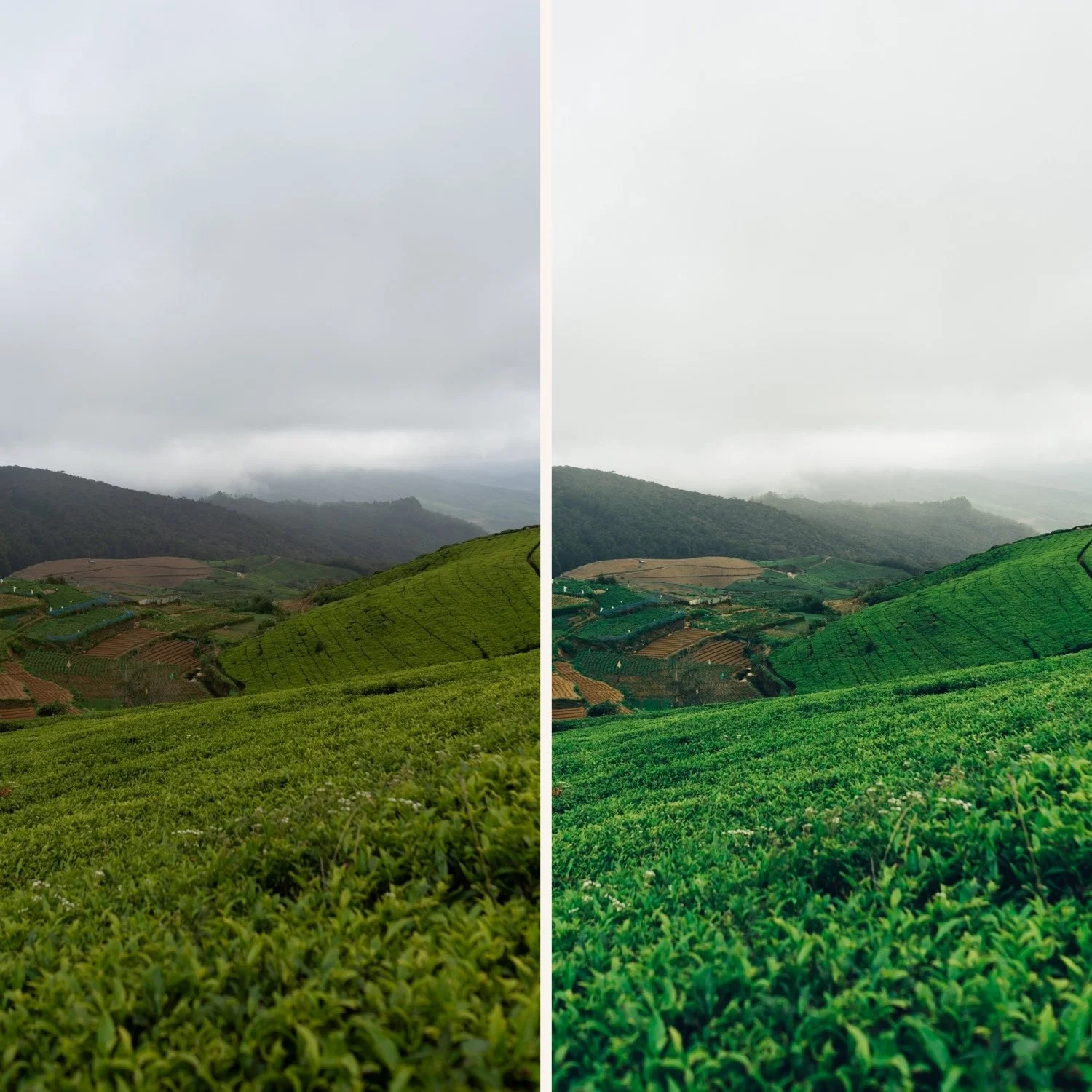
Landscape traveL
Cinematic landscape editing requires the most Green and Blue control of any travel scenario.
Green Hue: +12 to +16 toward yellow. Forest, jungle, and meadow photography has the most vivid digital greens.
Green Saturation: -18 to -22. More reduction than portrait or street work.
Aqua Saturation: -12 to -16. For coastal and water photography — reduces the cyan quality of digital sea and lake rendering.
Highlights: -50 to -60 for bright sky and water.
Best presets: C1 Warm Outdoor at 85%, A7 Soft Matte at 80%.
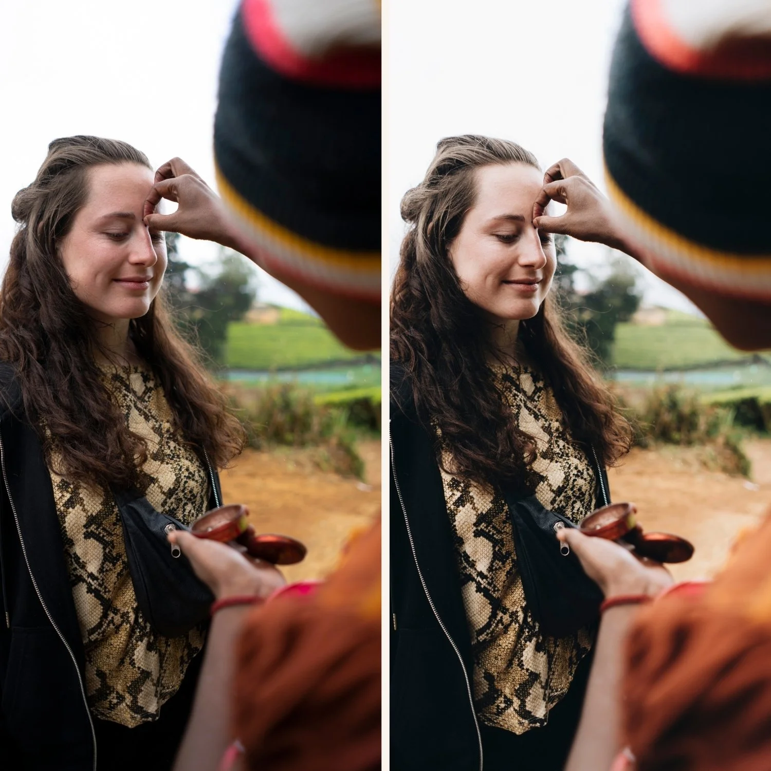
Portraits abroad
Travel portrait editing balances the cinematic visual identity with natural skin rendering.
The challenge: a highly cinematic preset can make skin look greyish or flat in locations with cool ambient light (northern Europe, overcast conditions, indoor scenes).
Solution: keep Orange Luminance +14 to +16 and add a Radial Gradient over the face with Shadow +8 and Highlights -5 to keep skin warmer than the ambient background.
Best preset: A6 Clean Portrait at 85%. The most versatile travel portrait preset.
Indoor and low light travel
Restaurants, markets, museum interiors, evening streets — the most challenging travel editing scenario.
White balance: correct to approximately 3,500-4,500K for tungsten and warm interior light before applying. Interior warmth plus warm preset creates orange.
Reduce preset strength to 75-80%.
Shadow Color Grading: Saturation 16-18. More saturation in the shadows compensates for the flat, low-contrast quality of indoor travel photography.
AI Denoise before grain on high-ISO indoor files (ISO 3200+).
Best presets: M4 Moody Classic at 78%, A6 at 78%.
Consistency across a travel series
The hardest part of cinematic travel editing is maintaining consistency when the light changes dramatically between locations. A morning mountain landscape and an afternoon street scene in the same city require different settings but should produce the same visual identity.
The approach: fix white balance and exposure per photo, keep the color calibration values identical. The preset handles the identity — white balance and exposure handle the local light.
Save a location-specific preset version for multi-day shoots. "Morocco markets" preset, "Iceland landscape" preset — same base, different white balance starting point. Batch apply within each location, then adjust exposure per photo.
FAQ
Why does my cinematic travel edit look flat instead of cinematic?
Contrast is being removed without enough tonal depth from the Tone Curve and Shadow Color Grading. Reducing Contrast without the Shadow Color Grading amber at Saturation 12-16 produces flat rather than cinematic. Add the Color Grading values above.
What is the difference between cinematic and moody travel editing?
Cinematic can be bright or dark — the defining quality is the tonal compression and controlled color. Moody is specifically darker, with deeper shadows and more saturated Color Grading. All moody travel editing is cinematic, but cinematic travel editing is not always moody.
Can I use the same preset in tropical locations and northern European cities?
Yes with white balance adjustment. Tropical light (warm, vivid) needs less preset warmth and more Orange Saturation reduction. Northern European light (cool, diffused) needs more white balance warming before the preset. The preset itself stays the same.
How many presets do I need for travel photography?
A versatile base preset (A6) handles 70% of travel scenarios. A warm golden option (A4), a cool urban option (A9), and a moody option (M4) cover the rest. Four presets is sufficient for full travel coverage.