Vintage Film Lightroom Preset — Complete Guide (2026)
Vintage Film Lightroom Preset — Complete Guide (2026)
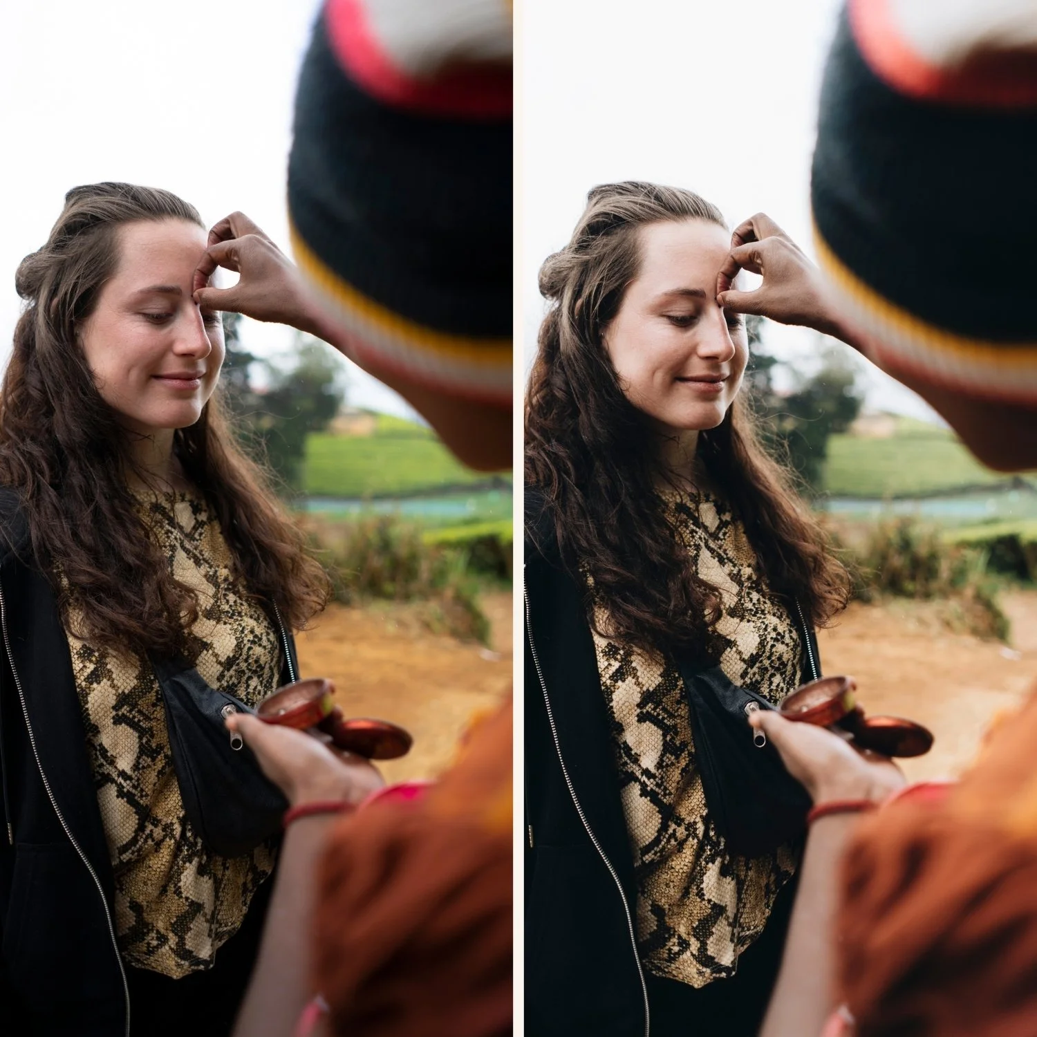
Vintage film editing is one of the most enduring aesthetics in photography. The warm, slightly faded quality of aged analog prints — lifted blacks, muted color, organic grain — creates a timeless feel that digital cameras can't replicate on their own.
It's not a trend. Photographers have been chasing this look for as long as digital cameras have existed because it references something real — the way photographs actually looked before digital processing made everything crisp, vivid, and perfectly exposed.
This guide covers exactly what the vintage film look is, the precise Lightroom settings to achieve it, how to avoid the most common mistakes, and which presets deliver the most authentic results across different photography scenarios.
What makes a photo look vintage film?
Vintage film has six defining characteristics that separate it from both clean digital editing and modern analog looks:
Lifted blacks — the most important characteristic. Film never renders true black. The darkest shadows lift to a warm dark grey, giving images a soft, slightly faded quality. When you see photos where even the deepest shadows have warmth and texture, that's lifted blacks.
Warm color cast — yellows and oranges are slightly emphasized. Blues and greens are muted. The overall palette leans warm without being orange. This references the color rendering of aged photographic prints and warm-toned film stocks.
Reduced saturation — colors feel natural and aged rather than vivid. Vintage film editing is never about punchy or vivid color — it's about muted, organic tones that feel like they belong to an older photograph.
Soft contrast — no harsh midtone contrast. Everything feels slightly compressed. The tonal range is narrower than modern digital editing and the transition between light and dark is gradual rather than abrupt.
Organic grain — random, textured grain that adds character rather than noise. Vintage film grain is coarser and more irregular than modern analog grain. Size 30-40 with high roughness (45-55) recreates this in Lightroom.
Slight color fade — the overall palette feels slightly desaturated, as if the photo has aged. This is different from just reducing saturation — it's a specific combination of lifted blacks, muted color, and warm grading that reads as aged rather than simply desaturated.
Vintage film vs analog film — what's the difference?
These two aesthetics are closely related but serve different purposes and create different feelings.
Vintage film is deliberately aged. Higher lifted blacks, more muted color, warmer shadow tones, more pronounced grain. It references old photographs — the kind with the slightly yellowed whites and faded shadows of a print that's been sitting in a drawer for twenty years. The feel is nostalgic and deliberately referential.
Modern analog film is cleaner and fresher. It has film characteristics — grain, lifted shadows, soft highlights — but doesn't feel aged. It feels like a well-exposed photo shot on quality 35mm film today. The Analog Film Archive sits in this territory.
Retro/vintage sits between the two — more stylized than modern analog but less aged than true vintage. The Juniper Archive covers this space. Knowing which aesthetic you want before editing saves significant time — each requires a different approach in Lightroom.
Exact Lightroom settings for vintage film
Work through these adjustments in order for the most authentic vintage film result.
Basic panel:
Exposure: +0.2 to +0.4 (slightly bright base — vintage film was typically exposed generously)
Contrast: -20 to -30 (significantly lower than digital — vintage film has soft contrast)
Highlights: -20 to -35 (protect highlights — vintage prints never clip)
Shadows: +20 to +35 (lift shadows — key to the faded quality)
Whites: -15 to -25
Blacks: +20 to +35 (the single most important slider — this creates the characteristic faded look)
Tone Curve — critical for vintage:
Lift the bottom-left anchor point significantly (this is where the "fade" comes from)
Bring the bottom-left point up by 20-30 units for a true matte quality
Soften the top-right anchor point — highlights fade rather than clip
Keep midtones at a slight upward curve — vintage film has bright, airy midtones
Color Grading:
Shadows: warm amber tint — move the hue dot toward orange/amber, saturation around 20-30
Highlights: slight warm yellow
Midtones: neutral to slightly warm
This creates the characteristic warm shadow quality of aged film
HSL — Hue:
Yellow: shift toward orange (+5 to +10) — warm vintage cast
Green: shift toward yellow (+10 to +15) — organic, aged green quality
Blue: shift toward cyan (+5) — slightly muted blues
HSL — Saturation:
Green: -20 to -30 (muted greens are key to the vintage look)
Blue: -25 to -35 (significantly desaturated blues)
Aqua: -15 to -20 Red: -5 to 0 (slightly muted reds)
HSL — Luminance:
Orange: +10 to +15 (brightens skin naturally)
Yellow: +5 to +10
Effects:
Grain Amount: 25-35 (more than modern analog)
Size: 30-40 (larger than modern film grain — vintage film was grainier)
Roughness: 45-55 (higher roughness adds the irregular quality of aged grain)
Vignette Amount: -10 to -20 (subtle vignette — vintage prints often have edge darkening)
Vignette Feather: 70-80
The most common vintage film mistakes
Not lifting blacks enough — the most frequent mistake. If your blacks go anywhere near pure black, the image doesn't read as vintage. Blacks need to be +20 minimum. Most photographers are surprised by how high you need to go.
Wrong color temperature — vintage film is warm. If your white balance is too cool, the warm color grading fights against it and creates a muddy result. Set white balance to neutral or slightly warm before applying vintage adjustments.
Too much grain size — there's a difference between vintage grain and noise. Grain Size above 45 starts to look like digital noise rather than film. Stay between 30-40 for authentic vintage grain. Oversaturating the fade — vintage film is not the same as faded color film simulation. If you're aggressively muting all saturation channels, the result looks like a filter rather than a vintage print. Target greens and blues specifically and leave skin tones (oranges) relatively natural.
Forgetting the tone curve — the Blacks slider alone doesn't create the vintage fade. The tone curve lift of the black point is what creates the true matte, faded quality. Without the tone curve adjustment, lifted blacks can look grey and flat rather than warmly faded.
Vintage film in different lighting conditions
Golden hour — vintage presets work beautifully at golden hour. The warm light amplifies the preset's warm color science. Pull highlights back more (-40 to -50) than usual as golden hour light is already bright and warm.
Overcast light — vintage presets work well but need adjustment. The flat, cool light can make warm vintage tones look muddy. Increase the warm color grading slightly and lift shadows more to compensate for the grey quality of overcast light.
Indoor / artificial light — warm indoor light plus a warm vintage preset can push into orange territory. Set white balance manually before applying and reduce the shadow color grading warmth slightly.
Bright midday light — vintage presets struggle in harsh midday light. The high contrast of midday sun fights against the soft, low-contrast quality of vintage film. If shooting midday, wait for shade or reduce exposure significantly before applying the preset.
Vintage film on Lightroom Mobile
Vintage presets work on Lightroom Mobile but need preparation. Mobile cameras apply HDR processing and sharpening that makes vintage grain look like digital noise.
Before applying:
Set Clarity to -10 to -15
Reduce Sharpening from 40 to 15-20
Disable Smart HDR in iPhone settings (Settings → Camera → Smart HDR off)
This gives the preset a softer, more film-like base to work with — the vintage grain will look organic rather than noisy.
Install guides:
How to Install Lightroom Presets on iPhone
How to Install Lightroom Presets on Android
The Juniper Archive — complete vintage film system
The Juniper Archive (J-Series) is built around warm vintage film tones with lifted blacks and a soft, slightly faded quality. Six presets covering different intensities and lighting conditions — from subtle warm vintage to full matte fade.
J1 — Vintage Warm Base The foundation vintage film look. Warm shadows, lifted blacks, natural color. The most versatile starting point — works across portraits, lifestyle, and travel. This is the preset to reach for when you want vintage character without the full aged quality.
J2 — Heritage Fade More pronounced fade than J1. Deeper lifted blacks and slightly more muted color. The full vintage quality. Best for portraits and lifestyle photography where you want the image to feel genuinely aged rather than just warm.
J3 — Golden Vintage Warmer and richer than J1 and J2. Golden highlights and warm midtones that enhance scenes already shot in warm light. Best for golden hour and outdoor vintage editing where the ambient warmth and the preset's warmth work together.
J4 — Soft Matte Flat, matte finish with maximum lifted blacks. The most faded preset in the collection — a deliberate, stylized vintage aesthetic. Best when you want the vintage look to be immediately apparent rather than subtle.
J5 — Warm Editorial Vintage with slightly more contrast than J1-J4. The editorial quality of vintage film without the full fade. Works well for fashion and lifestyle photography where you want the vintage color science but more tonal presence.
J6 — Cool Vintage The only cooler-leaning preset in the series. Slightly blue-green shadows with warm highlights creates a vintage cross-processed feel. Unusual and distinctive — works particularly well for travel and street photography where a slightly unexpected color palette adds interest.
→ Get the Juniper Archive — $27
Or get the full collection including the Juniper Archive and all other series:
Best photography for vintage film editing
Portrait and lifestyle — vintage tones are flattering on skin and work beautifully for casual, authentic moments. The warm shadow quality and lifted blacks create a timeless quality that suits lifestyle photography.
Travel photography — the aged, timeless quality is particularly effective for travel in older cities, natural environments, and any location where the vintage feel adds historical resonance. European travel is especially well-suited.
Street photography — urban texture and vintage film work naturally together. The grain adds character to the environment and the warm shadows give depth to shadowed urban spaces.
Candid and documentary — vintage editing adds a sense that the moment has historical weight. Candid family photography and documentary work both benefit from the timeless quality.
Film photography scans — if you shoot actual film, vintage presets can be used to standardize the color across different rolls and create consistency in a mixed digital/analog workflow.
Retro and nostalgia content — intentionally nostalgic content performs well on social media. The vintage aesthetic is widely recognized and appreciated across audiences.
FAQ
What's the best vintage film Lightroom preset?
The Juniper Archive is the most complete vintage film system — six calibrated variations from subtle warm vintage to pronounced faded matte. At $4.50 per preset vs the $10 market price it's the best value vintage preset option. The J2 (Heritage Fade) is the most classically vintage of the six.
How do I make a photo look like old film in Lightroom?
The four essential adjustments: lift Blacks to +20-35, lift the tone curve black point significantly, add warm color grading to shadows (amber/orange direction), and reduce Green and Blue saturation in HSL by -20 to -30. Grain Amount 25-35 with Size 30-40 and Roughness 45-55 completes the look. The tone curve lift is the most important single adjustment.
What's the difference between vintage film and light and airy?
They're nearly opposite aesthetics. Light and airy is bright, clean, and high-key with minimal color effect. Vintage film is warm, faded, and lower-key with deliberate color aging. Light and airy works in bright natural light. Vintage film works in any light but particularly in warm-toned or lower-light scenarios.
Do vintage film presets work on iPhone photos?
Yes. Reduce Clarity to -10 to -15 and Sharpening to 15-20 before applying, and disable Smart HDR in iPhone settings. The grain will look organic rather than noisy with this preparation.
Can I use vintage presets for wedding photography?
Yes — vintage wedding photography is a consistent style with its own audience. Works particularly well for outdoor ceremonies, candid moments, and getting-ready shots. For full gallery consistency across varied lighting, J1 (Vintage Warm Base) and J3 (Golden Vintage) are the most versatile choices.
Why does my vintage edit look grey and flat instead of warm and faded?
Usually caused by incorrect white balance — if your starting point is too cool, the warm grading fights against it. Set white balance to neutral or slightly warm first. Also check that your Color Grading shadow setting is actually pushing toward amber/orange rather than neutral.
Related guides
Analog Film Archive — Complete Guide
Analog 06 Preset — Clean Minimal Film
Kodak Portra 400 Lightroom Preset Guide
How to Get the Film Look on iPhoneBest Lightroom Presets 2026