Kodachrome Film Lightroom Preset — Complete Guide (2026)
Kodachrome Film Lightroom Preset — Complete Guide (2026)
Kodachrome is the most iconic film stock ever made. From 1935 until its discontinuation in 2010, it defined the visual language of professional photography — the covers of National Geographic, the work of Steve McCurry, the color photographs of the mid-twentieth century that still look vivid and alive today.
What made Kodachrome distinctive was its color rendering. Vivid reds and oranges. Deep, slightly blue-shifted blues. Warm, creamy skin tones. High micro-contrast that made images feel sharp and three-dimensional. A saturation level that was rich without looking processed.
In 2026, the Kodachrome aesthetic remains one of the most searched film looks in Lightroom — because those characteristics are still compelling, still recognizable, and still impossible to achieve with standard digital processing.
This guide covers exactly what makes Kodachrome look the way it does, how to recreate it precisely in Lightroom, and which presets deliver the most authentic results.
What makes Kodachrome look the way it does?
Kodachrome was a reversal film — unlike negative film, which captures an inverted image that is then printed, Kodachrome captured a direct positive transparency. This technical difference is part of what gave it such distinctive color characteristics.
Vivid reds and oranges — Kodachrome's red layer was particularly well-developed, giving reds a richness and depth that no other film stock matched. In Lightroom terms, this means Red saturation +15-25 and a slight Red hue shift toward orange.
Deep, saturated blues — Kodachrome blues are vivid and slightly shifted toward cyan rather than the warmer blue of most color negative film. Blue saturation +20-30 and a slight Blue hue shift toward cyan.
Warm, accurate skin tones — despite its vivid saturation, Kodachrome rendered skin warmly and naturally. The key is that it was specifically engineered for accurate color rendering — the vivid saturation enhanced colors without distorting them.
High micro-contrast — the sharpness and three-dimensionality of Kodachrome images comes from high micro-contrast. In Lightroom, slight positive Clarity and Texture recreates this quality.
Moderate grain — finer grain than most film stocks, appropriate for a professional slide film.
Moderate contrast — slightly higher contrast than color negative film but not as aggressive as high-contrast black and white film.
Kodachrome vs other Kodak film stocks
Understanding where Kodachrome sits in the Kodak ecosystem helps you know when to use it.
Kodachrome vs Kodak Portra 400 Portra is softer, warmer, and more natural — specifically engineered for portrait and skin tone work. Kodachrome is more vibrant, more saturated, and more contrasty. Portra is for portraits and weddings. Kodachrome is for travel, landscape, and any subject where you want rich, vivid color.
Kodachrome vs Kodak Ektar 100 Ektar is the most vibrant and saturated color negative film Kodak made. It's similar to Kodachrome in vibrancy but has higher contrast and less flattering skin tones. Ektar is for landscapes and architecture. Kodachrome handles both landscapes and people.
Kodachrome vs Kodak Gold 200 Kodak Gold is warmer, more casual, and less vibrant than Kodachrome. Gold has a snapshot quality. Kodachrome has a professional quality. Different use cases entirely.
Exact Lightroom settings for Kodachrome
Basic panel:
Exposure: 0 to +0.3 (Kodachrome was typically correctly exposed — not overexposed like Portra)
Contrast: +10 to +20 (slightly more contrast than film presets — slide film has more punch)
Highlights: -15 to -25
Shadows: +5 to +15
Whites: -5 to -15
Blacks: 0 to +10
Presence:
Texture: +5 to +10 (high micro-contrast is key)
Clarity: 0 to +10
Vibrance: +10 to +20 (higher than most film presets — Kodachrome is vivid)
Saturation: 0 to +5
Tone Curve:
Moderate S-curve — more contrast than analog film presets but less than cinematic
Black point at 0 to slightly lifted
Highlights protected but not as aggressively as vintage film
HSL — Hue:
Red: shift slightly toward orange (+5) — warms reds toward Kodachrome's red rendering
Orange: shift slightly toward red (-5)
Blue: shift toward cyan (+5 to +10) — key Kodachrome characteristic
HSL — Saturation — the most important section:
Red: +15 to +25 (vivid reds are the defining Kodachrome characteristic)
Orange: +10 to +15
Yellow: +5 to +10
Blue: +20 to +30 (deep blues — equally important as reds)
Green: -5 to +5 (relatively natural — Kodachrome greens are good but not the focus)
HSL — Luminance:
Orange: +10 to +15 (brightens skin within the vivid palette)
Blue: -10 to -15 (deeper blues enhance the slide film quality)
Color Grading:
Shadows: neutral to very slight warm
Highlights: neutral to very slight warm
Keep color grading subtle — Kodachrome gets its character from HSL, not from color grading
Effects:
Grain Amount: 15-25 (finer than vintage film — Kodachrome was a professional slow-speed film)
Size: 20-25
Roughness: 35-45
Common Kodachrome editing mistakes
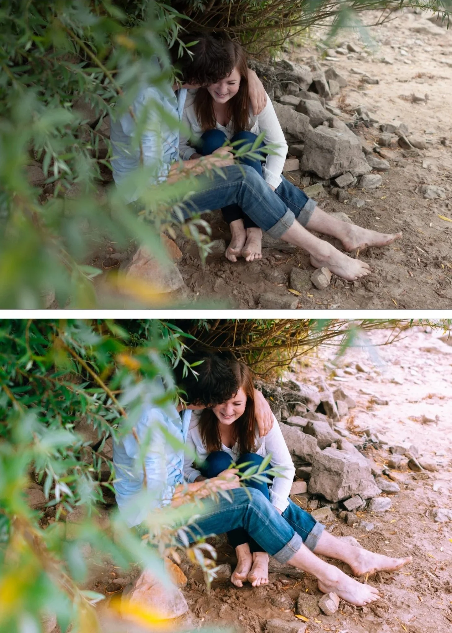
Under-saturating reds and blues — the defining characteristic of Kodachrome is vivid reds and deep blues. If you're timid with Red saturation (+5) and Blue saturation (+10), it doesn't read as Kodachrome. Push Red to +15-25 and Blue to +20-30.
Wrong hue on blues — Kodachrome blues are slightly cyan rather than warm blue. If your blues look warm or purple, shift the Blue hue toward cyan in the HSL panel.
Too much overall contrast — Kodachrome has moderate contrast. Pushing contrast too high makes it look like HDR rather than slide film. Keep Contrast at +10-20 maximum.
Forgetting skin tones — high saturation everywhere except skin. The Orange Luminance adjustment (+10-15) keeps skin bright and natural within the vivid palette. Without it, skin can look flat or slightly orange compared to the vivid surrounding colors.
Applying to wrong subjects — Kodachrome is for subjects with inherently interesting color — landscapes, travel, street photography with vivid environments. On a grey urban scene or a flat overcast landscape, the vivid saturation has nothing to enhance and looks over-processed.
When Kodachrome works and when it doesn't
Works best for:
Travel photography in colorful environments — markets, architecture, street scenes with vivid color. Kodachrome's vivid saturation makes colorful subjects even more compelling.
Landscape photography with dramatic color — sunsets, autumn foliage, spring flowers, coastal scenes. The rich reds and blues enhance natural color without making it look artificial.
Street photography in warm or colorful light — golden hour urban scenes, markets, festivals. The vivid rendering adds energy.
Nature and wildlife photography — the combination of vivid color and good skin/feather tone rendering makes Kodachrome-inspired editing work well for nature subjects.
Avoid for:
Portraits in controlled light — the vivid saturation can make skin tones feel processed. Use Portra-inspired presets for portrait-focused work.
Moody, dark, atmospheric photography — Kodachrome's vibrancy fights against dark, atmospheric editing. Use moody presets for that aesthetic.
Overcast, flat light — without strong color to enhance, Kodachrome vivid rendering looks over-processed.
The Chromatic Archive — Kodachrome-inspired preset system
The Chromatic Archive (K-Series) is built around the rich, saturated color science of classic slide film photography. Three presets covering different Kodachrome interpretations from classic to high contrast.
K1 — Classic Kodachrome The most faithful recreation of the original Kodachrome look. Rich reds, deep blues, warm skin tones, moderate contrast. The starting point for anyone who wants the Kodachrome color science without any interpretation.
K2 — Warm Kodachrome Warmer and slightly more saturated than K1. Enhanced golden tones with the same vivid color rendering. Best for warm-light scenarios — golden hour, late afternoon, warm environments — where the added warmth enhances the already-warm light.
K3 — High Contrast Slide More contrast and deeper color than K1 and K2. Approaches the dramatic quality of older Kodachrome stocks before the formula was refined. Best for landscape and travel photography where you want maximum visual impact.
→ Get the Chromatic Archive — $19.95
For the extended Kodachrome+ series with softer, more modern interpretation:
→ Get the Kodachrome+ Archive — $14.95
Or get both plus every other collection:
Kodachrome on Lightroom Mobile
Kodachrome's vivid saturation can look harsh on mobile if the base image has mobile camera sharpening applied. Before applying a Kodachrome-inspired preset on Lightroom Mobile:
Reduce Sharpening from 40 to 25-30 (less than other presets — Kodachrome has natural micro-contrast from Texture and Clarity, not sharpening)
Keep Clarity at 0 to +5
Check that highlights aren't blown — mobile HDR can push highlights past the point where a vivid preset can recover them
Install guides:
FAQ
What is a Kodachrome Lightroom preset?
A Kodachrome preset recreates the rich saturated color, vivid reds and blues, warm skin tones, and moderate contrast of Kodachrome slide film photography. The key characteristics are Red saturation +15-25, Blue saturation +20-30, and a Blue hue shift toward cyan — the three adjustments that most define the Kodachrome color rendering.
How do I get the Kodachrome look in Lightroom?
The HSL panel is your most important tool. Push Red saturation to +15-25 and Blue saturation to +20-30. Shift Blue hue toward cyan (+5-10). Add slight positive Clarity (+5-10) for micro-contrast. Keep contrast moderate (+10-20) — not aggressive. This combination creates the core Kodachrome characteristics.
What's the difference between Kodachrome and Kodak Portra in Lightroom?
Kodachrome is vivid, saturated, and moderately contrasty — best for travel, landscape, and colorful subjects. Portra is soft, warm, and skin-optimized — best for portraits and weddings. In Lightroom terms, Kodachrome uses positive Vibrance and strong Red/Blue saturation. Portra uses negative Clarity and lifted shadows with muted color.
Why do my Kodachrome edits look over-processed?
Usually because the scene doesn't have inherently colorful subjects for the vivid saturation to enhance. Kodachrome works best on subjects with strong color — red buildings, blue sky, green foliage. On grey, flat, or monochromatic scenes, the saturation boost looks processed rather than natural.
Does Kodachrome work for portrait photography?
With adjustment, yes. The Orange Luminance adjustment (+10-15) keeps skin bright and natural. The key is not over-pushing Red saturation — keep it at +15 rather than +25 for portrait work. The Chromatic Archive K1 is the most portrait-friendly of the three presets.
What happened to Kodachrome film?
Kodachrome was discontinued by Kodak in 2009 after 74 years of production. The final roll was processed in 2010. The discontinuation was due to the complex, hazardous chemical process required for development — called K-14 — which only a handful of labs worldwide could perform. The last lab to process Kodachrome was Dwayne's Photo in Kansas, USA.