Muted Luxury Lightroom Preset — Complete Guide (2026)
Muted Luxury Lightroom Preset — Complete Guide (2026)
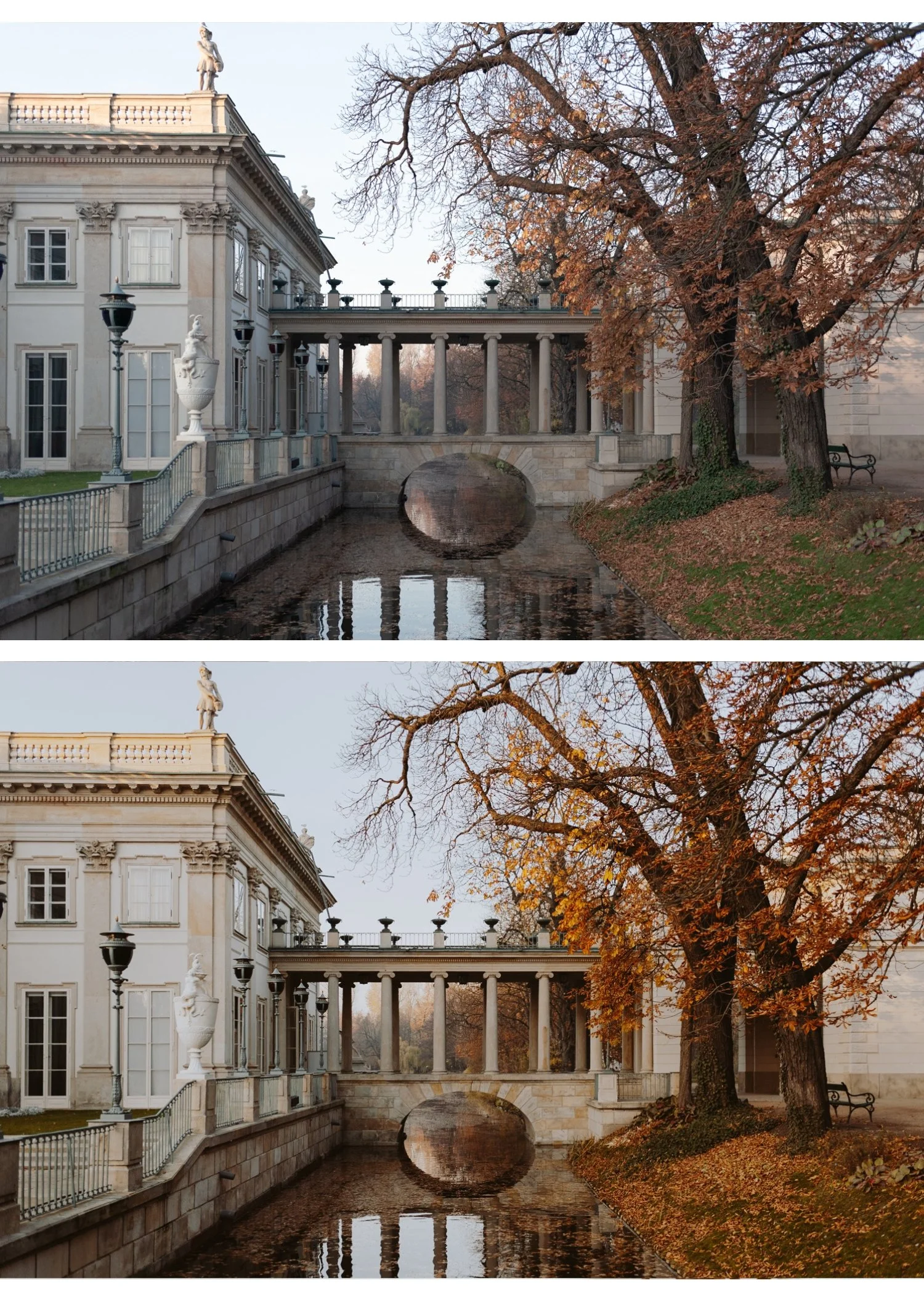
Muted luxury editing communicates one thing above all else: restraint. The most expensive-feeling photography in fashion, architecture, and lifestyle does not shout with vivid colour or dramatic editing. It whispers. Refined tones, controlled contrast, a quality that reads as intentional and considered.
It is the visual language of high-end magazines, luxury brand campaigns, and the quiet confidence of photographers who understand that less is always more.
This guide covers exactly what the muted luxury aesthetic is, the precise Lightroom settings to achieve it, how to avoid the most common mistakes, and which presets deliver the most consistent results.
What defines the muted luxury aesthetic?
Six characteristics separate genuine muted luxury editing from simply turning down the saturation.
Desaturated but not grey. Colour is present but pulled back. The palette feels curated rather than vivid. Every colour still reads as itself, just quieter. If your image looks grey rather than refined, you have gone too far.
Soft, controlled contrast. No harsh shadows, no blown highlights. Tonal transitions are smooth and gradual. The editing feels considered, not dramatic.
Clean whites that stay white. Luxury photography keeps bright areas genuinely white rather than warm or hazy. White walls, white clothing, white marble should all stay neutral. The moment whites go creamy or warm, the luxury quality disappears.
Neutral to slightly cool tone bias. Muted luxury leans cool or neutral rather than warm. This is one of the most important and counterintuitive characteristics. Warmth reads as casual and inviting. Cool neutrality reads as sophisticated and exclusive. The difference between a lifestyle photo and an editorial photo is often just the colour temperature direction.
Tonal depth without drama. Muted luxury is not flat. There is still depth in shadows and detail in highlights. The muting applies to colour saturation, not tonal contrast. A flat image looks like a mistake. A muted luxury image has structure and depth, just without colour noise.
No visible editing. The goal is for photos to look like they were taken well, not processed heavily. Heavy grain, obvious colour grading, and visible preset artefacts all work against the luxury quality. Subtlety is the point.
Exact Lightroom settings for muted luxury
Work through these adjustments in order for the most consistent results.
Basic panel:
Exposure: 0 to +0.2
Contrast: -20 to -30
Highlights: -20 to -30
Shadows: +10 to +20
Whites: -10 to -15
Blacks: +10 to +20
Presence:
Texture: -5 to -10
Clarity: -10 to -20 (important — removes digital harshness that fights against the refined quality)
Vibrance: -25 to -35 (the most important slider for muted luxury)
Saturation: -10 to -15
Tone Curve:
Gentle S-curve to maintain tonal depth without harsh contrast
Slightly lifted black point (bottom-left anchor up 5-8 units)
Softened highlights (top-right anchor slightly pulled down)
HSL — Saturation (the most important section):
Red: -10 to -15
Orange: -5 to -10 (keep skin relatively natural — less reduction than other channels)
Yellow: -15 to -20
Green: -20 to -25
Aqua: -15 to -20
Blue: -20 to -25
Purple: -10 to -15
Magenta: -10 to -15
The Orange channel is the most critical for portrait and lifestyle work. Reducing it too aggressively (below -15) makes skin look grey and flat. Keep Orange at -5 to -10 maximum.
Color Grading — the defining section for luxury quality:
Shadows: very slight cool grey (hue 200-220, saturation 5-8)
Highlights: neutral or very slight warm ivory (hue 30-50, saturation 3-5 maximum)
Midtones: neutral
The cool shadow grading creates the specifically luxury quality. Keep saturation very low — 5-8 maximum. If you can clearly see the colour grading, it is too much.
Effects:
Grain Amount: 8-15 (very subtle — luxury editing uses minimal grain)
Size: 18-22
Roughness: 30-40
Muted luxury vs related aesthetics
Understanding the distinctions helps you stay in the right direction.
Muted luxury vs old money. Old money is a broader lifestyle aesthetic covering styling, composition, and subject matter. Muted luxury refers specifically to the editing approach. Old money photos use muted luxury editing as their foundation, but muted luxury editing can be applied to any subject. For the full old money guide: Old Money Aesthetic Lightroom Preset
Muted luxury vs clean girl. Clean girl is brighter and more luminous. Muted luxury is more desaturated and cooler. Clean girl feels effortless and accessible. Muted luxury feels refined and exclusive. For clean girl: Clean Girl Aesthetic Lightroom Preset
Muted luxury vs moody. Moody is warmer and darker with atmospheric depth. Muted luxury is neutral-to-cool and balanced. Moody communicates emotion. Muted luxury communicates sophistication.
Muted luxury vs film/analog. Film editing has lifted blacks and a warm organic quality. Muted luxury is cooler and more controlled. Both are desaturated but in different directions and with different intentions.
Muted luxury in different lighting conditions
The settings above are calibrated for a neutral starting point. Different lighting conditions need specific adjustments.
Bright daylight and outdoor architecture. Daylight renders slightly warm and vivid. After applying the preset, check that greens and blues are not still too vivid. Reduce Green Saturation an additional -5 to -10 if outdoor foliage is too present in the image.
Indoor and studio photography. Indoor lighting varies enormously. Tungsten light adds warmth that fights against the cool neutral direction. Set white balance manually to neutral or slightly cool before applying the preset. If whites still look warm after applying, add a slight negative Temperature adjustment (-100 to -200).
Overcast and grey days. Overcast light is naturally desaturated and cool. The preset may do too much on already flat grey days. Reduce the Vibrance adjustment to -15 to -20 and lift Exposure slightly more (+0.3 to +0.4) to compensate for flat ambient light.
Golden hour. The warm quality of golden hour fights against muted luxury. Reduce Temperature significantly before applying (-300 to -500) to neutralise the warmth, then apply the preset. The result should feel warm-neutral rather than golden.
The most common muted luxury mistakes
Making it grey, not refined. The most frequent problem. When you reduce all HSL Saturation channels by -25 or more, the result looks grey rather than desaturated. The fix is to reduce channels less aggressively (stay at -10 to -20) and use the Vibrance slider as your primary muting tool rather than the HSL channels.
Too much cool colour grading. A cool shadow tint with saturation above 15 becomes very visible and looks like an Instagram filter rather than editorial editing. Keep shadow Color Grading saturation at 5-8 maximum.
Losing tonal depth. Muted luxury is not flat. If your image has no contrast and no shadow depth, it looks like a technical error. Keep the tone curve S-curve intact and maintain Blacks at +10 to +20 maximum, not higher.
Applying to the wrong subjects. Muted luxury works with subjects that have inherent quality — good materials, considered composition, natural subject matter. Applied to a photo with a cluttered background, mixed colours, or no compositional intention, the muting makes the problems more obvious rather than less.
Heavy grain. Luxury editing uses very subtle grain or none at all. If you can clearly see grain on the image, it is too much. Amount above 20 is almost always wrong for muted luxury.
Best subjects for muted luxury editing
Architecture and interiors. Stone, marble, wood, concrete. Muted luxury lets material quality speak without colour competing for attention. The refined palette enhances the quality of materials rather than adding colour that was not there.
Fashion editorial. Neutral clothing, quality fabrics, understated accessories. The editing direction reinforces the styling. Heavy colour grading would fight against a minimal styling direction.
Urban photography with intention. City environments photographed thoughtfully. The muted palette creates cohesion across the complex competing colours of urban environments.
Travel in heritage locations. European cities, historic architecture, old towns. The refined quality suits subjects with permanence and history.
Minimalist lifestyle. Clean, considered spaces and moments where the editing matches the subject's own restraint.
Portrait work with neutral backgrounds. Muted luxury for portraits works when the background supports the colour direction. White walls, neutral environments, open outdoor shade. Strong colour backgrounds fight against the muted palette.
Muted luxury on Lightroom Mobile
The Color Grading panel and HSL panel are both fully available on Lightroom Mobile. Before applying on iPhone photos, reduce Sharpening from 40 to 20-25. Mobile cameras add aggressive sharpening that makes the refined quality hard to achieve.
Also reduce Clarity before applying if it is not already in the preset. iPhone camera processing adds significant micro-contrast that fights against the smooth, refined quality of muted luxury editing.
Installation guides:
The Luxury Archive
The Luxury Archive (LV-Series) is built specifically for the muted luxury editorial aesthetic. Three presets covering different expressions of the same quiet, desaturated philosophy.
LV1 — Muted Clean The most balanced and versatile muted luxury preset. Neutral contrast, slightly desaturated, sophisticated quality. Works across architecture, lifestyle, fashion, and urban photography. Start here if you are new to the aesthetic.
LV2 — Quiet Cool The most distinctly luxury of the three. Cool undertones, deeper muted quality, a refinement that reads as expensive. Best for fashion editorial, high-end architectural interiors, and minimalist lifestyle content where the cool quality enhances the subject.
LV3 — Warm Muted Subtle warmth within the desaturated palette. For environments where the complete cool neutrality of LV2 feels too cold. Warm stone architecture, candlelit interiors, lifestyle photography in warm natural light.
$4.98 per preset. Muted luxury editorial quality for less than the price of one individual preset elsewhere.
Or get the Luxury Archive plus every other collection:
THE STUDIO ARCHIVE — 130+ PRESETS, $89
Free muted luxury starting point
The free A6 preset is clean and minimal — a good foundation for the muted luxury look. After applying, reduce Vibrance to -30, pull all HSL Saturation channels to -12, and add very subtle cool Color Grading to shadows (hue 200-220, saturation 6). That is the foundation of the muted luxury aesthetic from a single free preset.
FAQ
What's the difference between muted luxury and old money aesthetic?
Old money is a broader lifestyle aesthetic that includes styling, composition, and subject matter. Muted luxury refers specifically to the editing approach — desaturated, cool, refined. Old money photos use muted luxury editing as their foundation, but the aesthetic extends beyond editing to how photos are composed and styled.
Does muted luxury work for portrait photography?
Yes, with care. Keep Orange Saturation less reduced than other channels (-5 to -10 rather than -15 to -20) to maintain natural skin tones. LV3 Warm Muted is the most portrait-friendly preset in the collection. Check skin tones at 100% zoom after applying.
How do I keep whites clean in muted luxury editing?
Keep Color Grading highlight saturation very low (3-5 maximum) and ensure white balance is set correctly before applying. Whites go hazy when you add too much warm colour grading to highlights or when white balance is off. If whites look creamy rather than clean white, cool the Temperature slightly.
Can muted luxury work on iPhone photos?
Yes. Reduce Sharpening to 20-25 and Clarity to -10 before applying. iPhone processing adds crispness that fights against the refined quality. The full Color Grading and HSL tools are available in Lightroom Mobile.
What's the best preset for the muted luxury look?
LV2 Quiet Cool from the Luxury Archive is the most distinctly muted luxury of the three presets — cool undertones, refined desaturation, expensive-feeling quality. LV1 Muted Clean is the most versatile if you want a softer entry into the aesthetic.
What is the difference between muted and muted luxury?
Muted editing broadly reduces colour saturation. Muted luxury adds a specific cool tone direction, tonal refinement, and the minimal grain and clarity approach that creates the expensive, editorial quality. Muted is the technique. Muted luxury is the aesthetic application of that technique. For the broader muted guide: Muted Lightroom Preset Guide