Kodak Portra 400 Lightroom Preset — Complete Film Emulation Guide (2026)
Kodak Portra 400 is the most beloved portrait film ever made. Its warm skin tones, lifted shadows, soft highlight roll-off, and fine organic grain have defined the aesthetic of professional film photography for thirty years. In 2026 it remains the most imitated film stock in Lightroom — and for good reason.
This guide covers exactly what makes Portra 400 look the way it does, how to recreate it accurately in Lightroom, and how to adjust the look for different lighting conditions.
What makes Kodak Portra 400 look the way it does
Portra 400 has five defining characteristics that set it apart from every other film stock.
Warm, creamy skin tones. Portra renders skin with a warm, golden-creamy quality. Reds and oranges are slightly lifted while staying natural — no orange-skin effect. It was specifically engineered for portrait work, which is why skin looks so universally flattering on it. This is the characteristic that made Portra the professional portrait standard.
Lifted shadows. The blacks on Portra are never truly black. Shadows lift to a warm dark grey rather than crushing to pure black. This gives images a soft, open quality even in darker areas and is the most important single technical characteristic of the Portra look.
Soft highlight roll-off. Highlights on Portra roll off gradually rather than clipping sharply. Bright areas retain detail and feel soft — which is especially important for wedding dresses, bright skin highlights, and sky detail.
Fine organic grain. Portra 400's grain is fine and warm. It adds texture without looking digital or artificial — the grain reads as quality rather than noise.
Warm, natural color palette. Slightly warm overall, with greens that lean toward yellow-green and blues that are muted rather than saturated. The palette feels natural and timeless rather than vivid.
Kodak Portra 400 vs Fuji 400H
These are the two most imitated film stocks in Lightroom. The choice between them defines two fundamentally different editing directions.
Kodak Portra 400: Warm, creamy, immediately flattering. Warm shadow toning, rich skin tones, natural warmth. Works in any lighting condition. The most universally used professional portrait film.
Fuji 400H: Cool, airy, slightly ethereal. Cool to neutral shadow toning, slightly pale skin tones, very soft contrast. Works best in overcast and soft window light. The choice for photographers who want something lighter and more refined.
For warm light, golden hour, and photography where warm skin rendering is the priority — Portra 400. For overcast light, window light, and photography where a cool airy quality is wanted — Fuji 400H.
Full Fuji 400H guide: Fuji 400H Lightroom Preset Guide
Exact Lightroom settings for the Portra 400 look
Basic panel:
Exposure: +0.3 to +0.5 (Portra was typically slightly overexposed)
Contrast: -10 to -20
Highlights: -20 to -40
Shadows: +20 to +40
Whites: -10 to -20
Blacks: +15 to +25
Presence:
Texture: +5 to +10
Clarity: -5 to -10
Vibrance: -5 to +5
Saturation: -5 to 0
Tone Curve:
Lift the black point 12-18 units
Soften the highlight ceiling slightly
Gentle S-curve — slight uplift in the midtones
HSL — Hue:
Red: toward orange (+5 to +10)
Orange: toward yellow (+5 to +8)
Yellow: toward green (+5 to +8) — the Portra yellow-green characteristic
Green: toward yellow (+10 to +15) — warm organic green
HSL — Saturation:
Red: -5 to +5
Orange: +5 to +10 (warm skin)
Yellow: -5 to 0
Green: -10 to -15
Blue: -20 to -30 (Portra blues are muted)
HSL — Luminance:
Orange: +10 to +15 (skin brightness)
Green: -5
Blue: -10
Color Grading:
Shadows: slight warm amber (hue 25-40, saturation 10-15)
Highlights: very slight warm or neutral
Midtones: neutral
Grain:
Amount: 20-30
Size: 25-35
Roughness: 40-50
Adjusting Portra presets for different lighting
Portra 400 was designed to be shot in many conditions. Different light requires different adjustments after applying the preset.
Bright outdoor daylight. Pull Highlights -35 to -45 for sky and skin highlight protection. The preset adds warmth to already warm daylight — reduce Orange Saturation -5 if skin looks orange in strong sun.
Overcast outdoor. The flat, slightly cool quality of overcast light suits Portra well. Add Temperature +100 to +150 after applying to compensate for the cool ambient and give the Portra warmth its natural presence.
Golden hour. This is Portra at its best. The warm late-day light combined with the warm Portra palette creates a deeply flattering result. Reduce Orange Saturation -5 after applying to prevent combined warmth pushing toward orange.
Indoor window light. Set white balance to 5,000-5,200K before applying. Portra window light portraits are among the most beautiful applications of this film stock — soft, warm, luminous.
Indoor artificial light. Correct white balance to around 3,200-3,500K before applying for tungsten. The preset adds warmth on top — without white balance correction first, indoor Portra edits go very orange.
Studio flash. Set white balance to your flash's color temperature (usually 5,500-6,000K). Portra on flash photography creates a clean, warm, studio portrait quality.
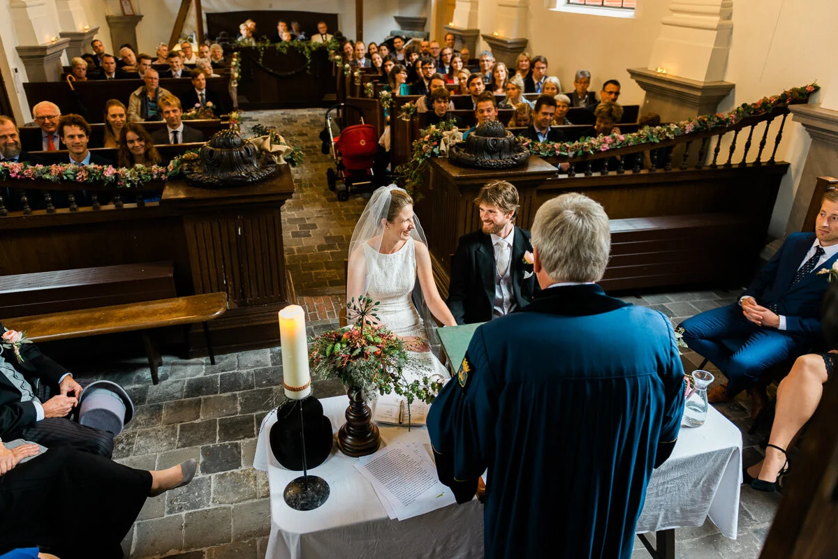
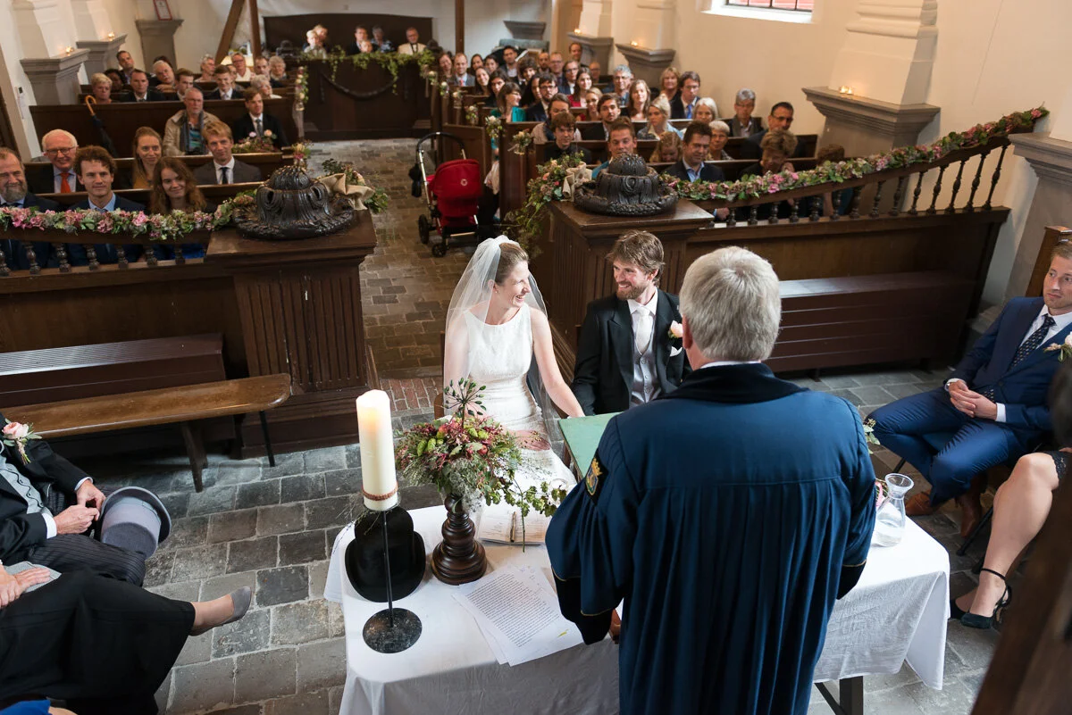
Portra 400 for wedding photography
Kodak Portra 400 was the dominant wedding film in the late 1990s and 2000s for specific reasons that translate directly to Lightroom preset use.
The warm skin rendering made every skin tone look flattering in the varied lighting of a wedding day. The soft highlight roll-off kept wedding dress whites detailed and luminous rather than blown out. The lifted shadows preserved detail in dark reception scenes without adding the heavy grain of pushing faster film stocks.
For wedding preset recommendations using the Portra philosophy: Best Lightroom Presets for Wedding Photography 2026
How to Get the Portra 400 Look in Lightroom MobilE
The settings above work identically in Lightroom Mobile — the panels have the same names and the values are the same. There are four phone-specific preparation steps that make a significant difference before applying.
Step 1 — Reduce Sharpening to 20-25 In the Detail panel. iPhone and Android cameras apply their own sharpening before Lightroom sees the file. Default Lightroom sharpening (40) on top creates harsh, digital results that fight against Portra's soft, organic quality.
Step 2 — Set Clarity to -8 to -12 Before applying any preset. Phone cameras add computational micro-contrast. Negative Clarity removes it and creates the soft, organic edge rendering that Portra had naturally.
Step 3 — Fix white balance manually Auto white balance on phones is inconsistent. For the Portra look: set Temperature to 5,400-5,600K and Tint to +5 to +8 before applying. This is the neutral-warm starting point that Portra presets are calibrated for.
Step 4 — Apply the preset at 75-80% strength Phone photos already have warmth added by computational photography. Full-strength Portra presets on iPhone and Android push skin toward orange. Reduce to 75-80% after applying using the strength slider.
iPhone ProRAW and Samsung Expert RAW For the best Portra quality on mobile, shoot in RAW. iPhone ProRAW (iPhone 12 Pro and later) and Samsung Expert RAW give 2-3 stops more highlight latitude — essential for the soft Portra highlight roll-off. JPEG photos have limited highlight recovery. Enable ProRAW in iPhone Camera settings, or download Expert RAW from the Galaxy Store on Samsung.
✨ DOWNLOAD THE FREE PORTRA-INSPIRED PRESET ✨
For the full mobile workflow: Lightroom Mobile Film Editing Guide
The Timeless Film Archive
The Timeless Film Archive includes a Kodak Portra 400-inspired preset alongside the Fuji 400H look and two classic black and white presets — four iconic film stocks in one collection.
EXPLORE THE TIMELESS FILM ARCHIVE — $27
Free Portra-inspired preset
The free A6 preset is built on film color science that references the clean, warm quality of classic portrait film. Apply it, lift Blacks to +20, add warm Color Grading to shadows (hue 35, saturation 12), and you have the foundation of the Portra look.
FAQ
What is Kodak Portra 400 known for?
Warm, creamy skin tones, lifted shadows, soft highlight roll-off, and fine organic grain. It was the dominant professional portrait and wedding film for thirty years because of its universal flatteringness across skin tones and lighting conditions.
How do I get the Kodak Portra 400 look in Lightroom?
The key adjustments: Blacks +20 to +25 (lifted shadows), Contrast -15 (soft contrast), Orange Saturation +5 to +10 and Orange Luminance +12 to +15 (warm natural skin), warm Color Grading in shadows (hue 30-40, saturation 12-15), and Grain Amount 20-25. These create the core Portra quality.
What is the difference between Kodak Portra 400 and Portra 160?
Portra 400 is faster (better for indoor and low light), slightly warmer, and with slightly more visible grain. Portra 160 is slower (better for bright outdoor), slightly cooler and cleaner, with finer grain. For Lightroom purposes, Portra 160 emulation would use slightly reduced warmth and finer grain settings.
Does Kodak Portra 400 work for all skin tones?
Yes — Portra was specifically engineered for universal skin tone rendering. For darker skin tones, increase Orange Luminance slightly more (+18 to +22) and keep Orange Saturation controlled (0 to +5) to prevent the warm rendering going toward orange.
Can I use the Portra 400 look on video in Lightroom?
Lightroom presets do not apply to video. For video, Lightroom's preset settings can be manually recreated as a LUT or applied in a video editing application that supports color grading.
Is Kodak Portra 400 still being made?
Yes — Kodak Portra 400 is still in production in 2026 and available in 35mm and 120 formats. It remains one of the most popular professional film stocks for film photographers.
Related guides
These photos are edited with Kodak Portra 400: