New Year Photo Editing Ideas — Film Look for January Photography (2026)
New Year Photo Editing Ideas — Film Look for January Photography (2026)
January photography has a distinct visual quality separate from December. The warmth of Christmas is gone — the light is cold and blue, the streets are quiet, and the most compelling January photography has a deliberate, editorial quality to it. This guide covers the film look editing approaches that work across the different scenarios of new year photography: fireworks, celebrations, blue hour, and the clean January aesthetic.
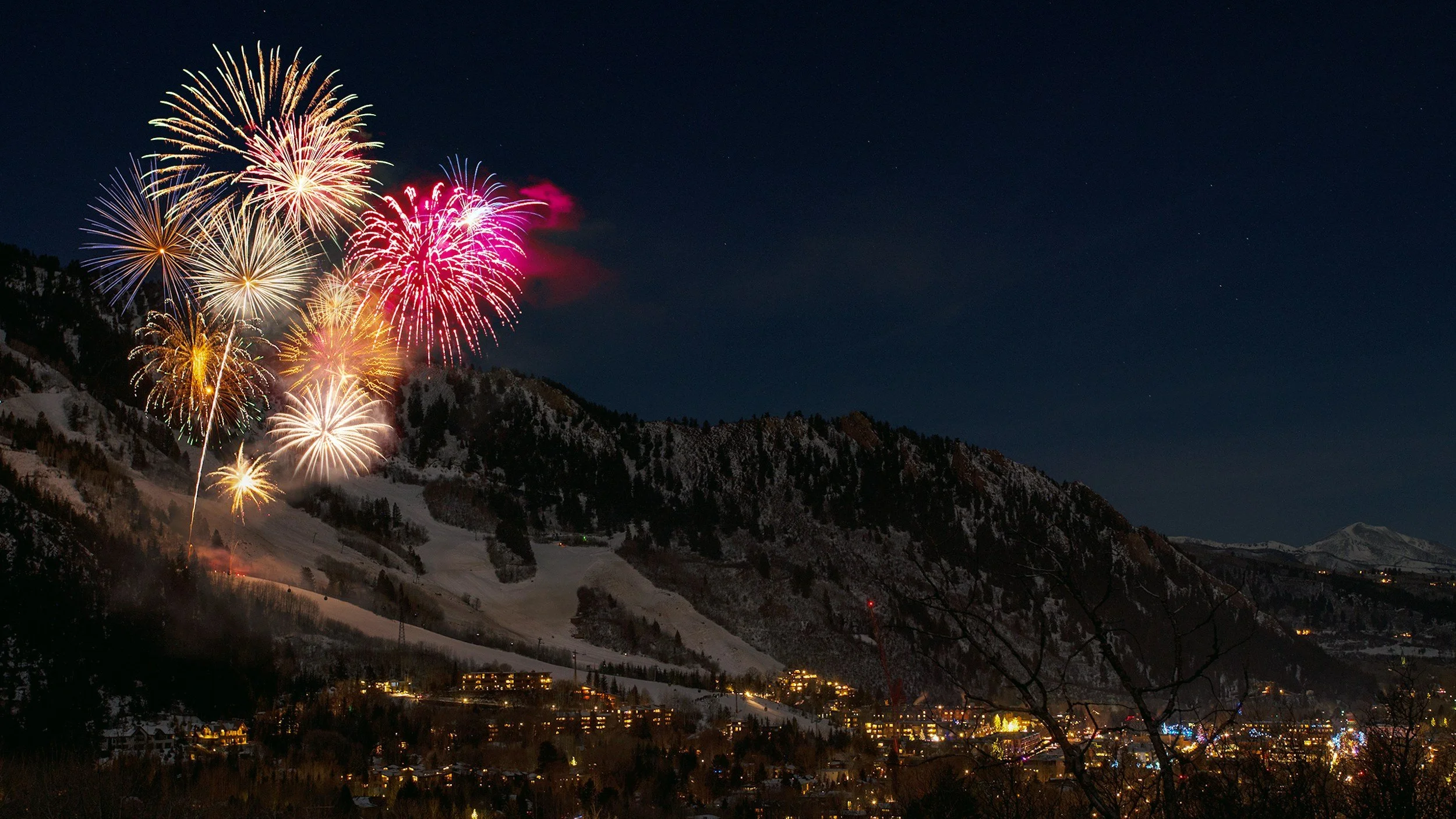
New Year's Eve — fireworks and celebrations
Fireworks photography has extreme contrast: bright explosion light against a pure dark sky. The editing approach needs to handle this specifically rather than applying the standard film look workflow.
White balance: keep cool. Fireworks are vivid colour bursts — correcting toward warm changes their character. Set Temperature to 4,800-5,400K and keep Tint neutral. Do not warm fireworks photography.
Highlights: -50 to -65. Fireworks clip very easily — the bright explosion cores are the most extreme highlights in any subject. Pull aggressively.
Blacks: +8 to +12. Less shadow lift than standard film look. Night photography has inherent darkness that is part of the aesthetic — do not lift shadows as aggressively as daytime work.
Shadows: 0 to +8. Minimal shadow fill. The dark sky should remain dark.
Grain: Amount 28-36, Size 28-34, Roughness 50-58. Night photography carries visible grain naturally. Higher than standard for the atmospheric quality.
Best preset: M4 Moody Classic at 75-78%. The controlled shadow depth handles the extreme contrast of a dark sky with bright fireworks better than brighter presets.
For indoor New Year's Eve celebrations (parties, champagne moments): A6 at 80% with White Balance corrected to the ambient indoor light first (3,500-4,500K for warm venue lighting).
Blue hour — the New Year transition
Blue hour on New Year's Eve and New Year's Day has a specific quality: the last or first light of the year, deeply blue, quiet, and atmospheric. The editing should preserve and enhance the blue-grey quality rather than warm it toward a standard film look.
White balance: 4,800-5,400K, Tint +3 to +5. The blue-grey quality is the aesthetic — do not warm aggressively. A slight Tint correction removes any green but keep the coolness.
Exposure: 0 to +0.2. Blue hour is naturally low-light — a slight lift prevents the photo from going too dark without destroying the atmospheric quality.
Shadow Color Grading: Hue 200-210, Saturation 5-7. A very slight cool shadow quality that references the ambient blue. The opposite of the warm amber in standard film look editing — the cool quality is intentional here.
Highlight Color Grading: Hue 40-42, Saturation 3-4. The very slight warmth of artificial street lighting against the cool ambient creates a specific colour separation.
Best preset: A9 Urban Neutral at 82% or B5 Cool Tone (B-Series) for a monochrome interpretation of blue hour.
January editorial — clean fresh start
The second strong direction for January photography is clean, minimal, deliberately fresh. White walls, bare surfaces, morning light, the editorial quality of a new beginning. This is the aesthetic of fresh start content — planners, coffee, clean workspaces.
White balance: 5,200-5,600K, Tint +4. Clean daylight, neutral-warm but not golden.
Tonal foundation: Exposure +0.2, Highlights -35, Blacks +22-28, Shadows +18-22. The fresh January quality is bright and airy rather than warm and intimate.
Color: Vibrance -8 to -12. Clean and slightly muted.
Grain: Amount 14-16, Size 22-24, Roughness 44-48. Fine, subtle grain for the clean editorial direction.
Best preset: A2 Bright Minimal or A6 Clean Portrait at 85%.
January landscape — bare trees and winter light
January landscape photography has specific beauty: low-angle winter sun, bare deciduous trees with graphic branch structure, frost on surfaces, and the blue-grey quality of overcast winter mornings.
White balance for overcast winter: 5,800-6,500K, Tint +5. Keep the cool quality — this is not a scenario to warm aggressively.
White balance for low winter sun: 5,200-5,400K, Tint +5. The low winter sun is warm but less intense than summer golden hour.
Blue Saturation: -14 to -18. Prevents vivid digital blue sky. Blue Hue +8 toward purple-grey for the more cinematic quality of winter sky.
Green Saturation: -20 to -25. Bare winter trees have minimal foliage, but any remaining evergreen or moss is very vivid in winter light.
Best preset: B5 Cool Tone (B-Series, black and white) for bare tree landscape. A9 Urban Neutral for architectural winter photography. M4 Moody Classic for atmospheric overcast winter scenes.
Reviewing your editing workflow in January
January is a natural time to assess your preset system before the new year of photography begins. Three quick checks:
Is your base preset still your direction? Look at your last 30 published photos. Do they look cohesive? If not, January is the right time to recalibrate before shooting more content.
Are you fixing white balance before applying? This single habit produces more consistent results than any other editing change.
Is your Camera Calibration profile set correctly per camera? Camera Neutral (Canon), Camera Standard (Sony), matching simulation (Fujifilm). Check that your saved presets include the correct starting profile for your camera.
The Analog Film Archive for January photography
The Analog Film Archive covers both the clean editorial direction (A2, A6) and the atmospheric winter and moody quality (A7, A9) suited to January photography.
Explore the Analog Film Archive — $27 →
For New Year's Eve atmospheric and fireworks photography, the Moody Film Archive is more appropriate:
FAQ
What is the best preset for fireworks photography?
M4 Moody Classic at 75-78% with Highlights pulled to -55 to -65. The controlled shadow depth handles the extreme dark-sky-to-bright-light contrast better than brighter, more open presets.
How do I make January photography feel less grey and flat?
Two adjustments: Exposure +0.2 to compensate for flat winter light, and Shadow Color Grading Hue 38 Saturation 12-14 for warmth in the shadows. The result reads as bright and inviting without fighting the ambient cool quality.
What makes January editing different from December?
December is warm and intimate — the editing direction is warm, lifted, and atmospheric. January is cooler, cleaner, and more minimal. A warm Christmas preset applied to a January street scene creates an uncomfortable temperature mismatch — the warm edit fights against the cold ambient light.
Can I use the same preset for both fireworks and editorial January content?
No — these are two very different scenarios. M4 for fireworks (dark, atmospheric, night). A6 or A2 for editorial clean content (bright, airy, neutral-warm). Using A6 on fireworks produces washed-out results; using M4 on clean editorial content produces over-dark results.
