Moody Film Preset Guide — How to Create a Cinematic Analog Look in Lightroom (2026)
Moody Film Preset Guide — How to Create a Cinematic Analog Look in Lightroom (2026)
Not every photo should feel bright.
Some photos should feel grounded. Heavy. Emotional. Intentional.
The moody film look is not about darkness — it's about depth. Warm shadows. Muted greens. Soft fade. Atmosphere without losing detail.
If your moody edits look muddy, crushed, or artificially dark, this guide will reset your approach.
What the moody film look actually is
Most people think moody means dark. It doesn't.
True moody editing has:
Controlled shadow depth — shadows are visible, not blocked
Warm but restrained highlights — atmosphere without orange skin
Muted greens and blues — natural, organic color
Balanced midtones — enough contrast to create depth without drama
Preserved dynamic range — detail in both highlights and shadows
The difference between moody and muddy is always in the highlights and shadows. Muddy editing crushes blacks and clips highlights. Moody editing controls them.
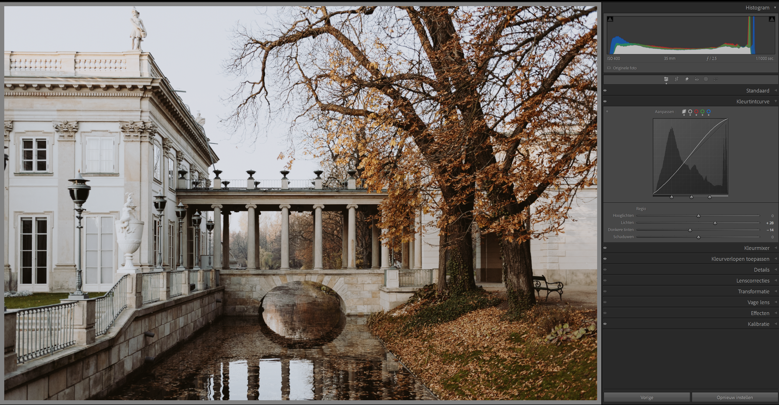
The exact Lightroom settings for the moody film look
These are the core adjustments that create the moody analog look from scratch. Use these as a reference — or as a starting point before applying a preset.
Basic panel:
Exposure: -0.2 to -0.5 (slightly underexposed base)
Contrast: -10 to -20 (lower contrast keeps it filmic rather than harsh)
Highlights: -25 to -40 (soft roll-off, never blown)
Shadows: +10 to +20 (lift slightly — don't crush blacks)
Whites: -15 to -25
Blacks: +5 to +15 (slightly lifted — film never goes pure black)
Presence:
Texture: 0 to +10 (subtle texture adds grain-like quality)
Clarity: -5 to -10 (negative clarity removes digital harshness)
Vibrance: -10 to -15 (muted, not colorless)
Saturation: -5 to -10
Tone Curve:
Gentle S-curve with lifted black point
Bring bottom-left anchor up slightly (lifts shadows)
Pull top-right anchor down slightly (protects highlights)
Add slight warmth in the midtones
Color Grading:
Shadows: slight warm amber tint
Highlights: neutral to very slightly cool
Midtones: neutral to warm
HSL — Hue:
Green: shift toward yellow (+10 to +15) — classic moody green
Aqua: shift toward blue (+5 to +10)
Blue: shift toward purple (+5)
HSL — Saturation:
Green: -20 to -30 (muted greens are key)
Aqua: -15 to -20
Blue: -15 to -25
Orange: -5 to +5 (keep skin natural)
HSL — Luminance:
Green: -10 to -15 (darker greens add depth)
Orange: +10 (brightens skin within the moody palette)
Effects:
Grain Amount: 20-30
Size: 30-35
Roughness: 45-55
The anatomy of a proper moody edit
Shadow depth — not black crush
The biggest mistake: dragging blacks down until everything disappears.
Instead, lower shadows slightly and use a soft fade on the tone curve. The goal is shadow separation — dark areas should still have visible detail, texture, and layers. When you lose that, the edit looks muddy, not moody.
Warm highlights without orange skin
Warm highlights create atmosphere. But pushing orange saturation destroys skin tones.
The solution: slightly warm white balance (+100 to +200K), reduce orange saturation by 5-10, and increase orange luminance by 10-15. That warms the image without making skin look orange.
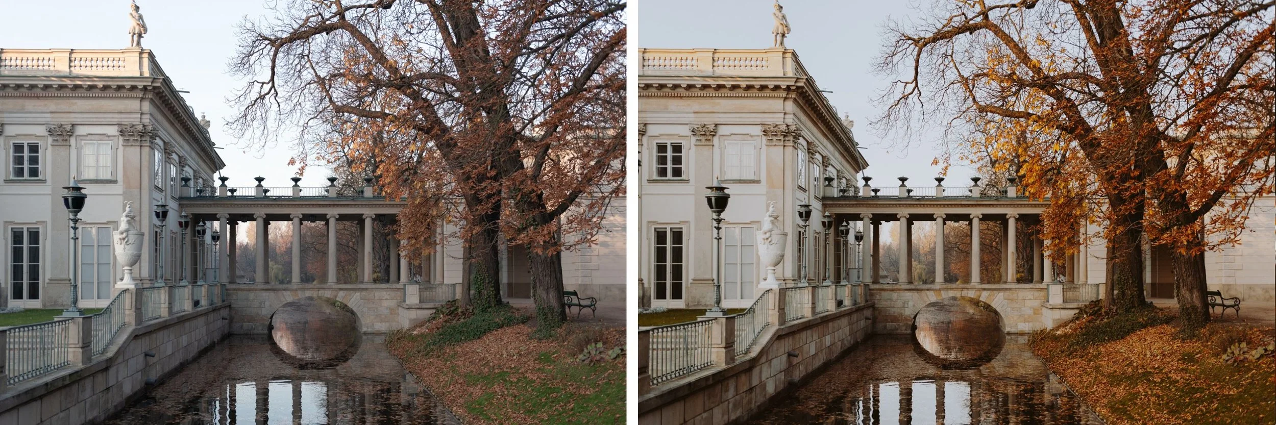
Muted greens and blues
This is the most distinctive characteristic of the moody analog look. Shift greens toward yellow-olive, reduce green saturation significantly, and lower aqua intensity. Blues should feel slightly desaturated and shifted toward purple-blue rather than cyan.
When you do this right, outdoor scenes lose the vivid digital green that immediately reads as "phone photo" and gain the muted, organic quality of analog film.
Controlled contrast curve
A good moody preset uses the tone curve rather than the contrast slider. The contrast slider affects midtones too aggressively. A tone curve with a lifted black point and softened highlights gives you cinematic depth without harshness.
When to use moody presets
Moody edits work best in:
Street photography — urban texture, directional artificial light, concrete and shadow. The moody look was made for this.
Autumn landscapes — golden-brown tones, muted greens, overcast light. The preset's color shifts enhance what's already there.
Intimate portraits — when the mood of the session is reflective or emotional rather than bright and energetic.
Rainy city scenes — wet pavement, reflections, grey skies. Moody editing enhances atmospheric depth in these conditions.
European travel — old architecture, stone streets, layered light. The warm-shadow quality of moody presets works particularly well here.
Avoid moody when: the scene is high-key bright, skin tones are the main focus in flat lighting, or the environment is a clean white interior. Forcing moody on the wrong image always looks wrong.
The Moody Film Archive — 6 presets explained
The Moody Film Archive contains six presets built on the same cinematic color philosophy — each calibrated for different lighting conditions and moody intensities.
M1 — Warm Shadow The baseline moody look. Warm shadows, controlled highlights, natural skin tones. The most versatile preset in the collection — works across street, portrait, and travel photography.
M2 — Deep Cinematic More contrast and depth than M1. Darker overall with stronger tonal separation. Best for dramatic scenes with directional light and strong shadows.
M3 — Earthy Fade A slightly faded, matte quality inspired by aged film prints. Muted color, lifted blacks, soft contrast. Works beautifully for travel and lifestyle photography where you want atmosphere without drama.
M4 — Autumn Warm Warm golden-brown tones that enhance autumn scenes. Shifts greens toward olive and yellows toward amber. Specific to warm-toned environments — golden hour, autumn foliage, candlelit interiors.
M5 — Cinematic Neutral The most neutral preset in the collection — less warm than M1-M4, slightly cooler shadows, more cinematic and less analog. Strong on street photography and architecture where you want mood without warmth.
M6 — Dark Film The most intense preset in the collection. Deep shadows, strong muted color, high grain character. Best used on images with strong directional light and clear subject separation — where the darkness serves the composition rather than fighting it.
Common moody editing mistakes
Crushing blacks — the most common mistake. Pure black shadows with no detail look digital and flat, not cinematic. Always maintain some shadow separation.
Too much clarity — clarity increases micro-contrast and makes shadows harsh and crunchy. For moody editing, keep clarity at 0 or negative.
Over-adding dehaze — dehaze makes moody edits look artificial and heavy-handed. Avoid it or use very sparingly.
Ignoring white balance — warm artificial light plus a warm moody preset equals orange skin. Always set white balance before applying the preset.
Heavy sharpening — moody edits benefit from softer rendering. Reduce sharpening from the Lightroom default of 40 to 20-25.
Forcing moody on wrong lighting — flat, bright, front-lit photos rarely work with moody presets regardless of how good the preset is. The lighting has to support the mood.
Moody on Lightroom Mobile
Mobile cameras apply HDR processing that makes shadows harsher and highlights more aggressive than desktop RAW files. Before applying a moody preset on mobile:
Reduce Clarity to -10 to -15
Lower Texture to -5 to -10
Reduce default Sharpening from 40 to 20
Check that HDR or Smart Tone is disabled in your camera settings
This gives the preset a softer base to work with — much closer to how it behaves on a desktop RAW file.
For the full mobile editing guide: Lightroom Mobile Film Editing — Complete Guide
Download the free moody preset
The free M5 preset gives you the cinematic neutral moody look — controlled shadows, muted color, soft contrast. Test it on a street photo, a travel shot, and a portrait before buying anything.
The Moody Film Archive
If the free preset works for your photography, the full Moody Film Archive gives you six calibrated variations on the same cinematic color philosophy — from warm and earthy to deep and dramatic. Built for street photography, travel, and portrait work. $4.50 per preset vs $10 market price.
EXPLORE THE MOODY FILM ARCHIVE — $27
Or get all 130+ presets including the full Moody Archive:
THE STUDIO ARCHIVE — 130 PRESETS, $89
FAQ
What makes a moody preset different from just lowering exposure?
Lowering exposure makes everything darker uniformly. A moody preset shapes the tonal range — lifting shadows slightly, pulling highlights back, adding warmth to specific areas, and shifting colors toward muted, organic tones. The result feels cinematic rather than underexposed.
Can moody presets work on iPhone photos?
Yes, but you need to reduce clarity and sharpening first. Mobile cameras add more sharpening and contrast than a camera RAW file, so the preset needs a softer starting point. See our iPhone install guide for installation instructions.
Why do my moody edits look muddy?
Almost always because shadows are crushed too aggressively. Lift your blacks slightly (+10 to +20), reduce clarity to 0 or negative, and make sure there's shadow detail visible in dark areas. Moody needs layers — not pure black.
Do moody presets work for portraits?
Yes, but with adjustments. After applying, increase Orange Luminance by 10-15 to brighten skin within the moody palette. Keep Orange Saturation close to neutral to avoid orange casts. The M1 and M5 presets are the most portrait-friendly in the Moody Archive.
What's the difference between dark moody and cinematic moody?
Dark moody has deeper shadows, stronger contrast, and more dramatic tonal range — best for high-contrast scenes with strong directional light. Cinematic moody has more controlled contrast, slightly lifted shadows, and a more balanced overall tone — works across more lighting conditions.
How many presets do I need for a consistent moody feed?
Two to three well-chosen presets handle most situations. One for daylight/outdoor, one for indoor/low light, and one for portraits. A good bundle gives you this coverage without needing to mix presets from different packs.
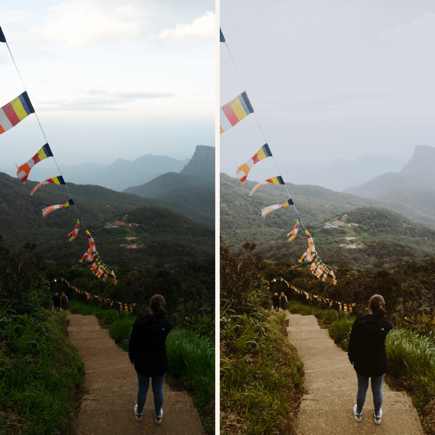
These photos are edited with the Moody 5 preset:


