Moody European Film Aesthetic Editing Guide
Moody European Film Aesthetic Editing Guide
Paris in the rain. Rome at dusk. Copenhagen under a grey November sky. The moody European film aesthetic is one of the most referenced editing directions in travel photography — and one of the most misunderstood. It is not dark photography. It is not crushed blacks and teal shadows. It is controlled atmosphere: restrained saturation, layered shadow depth, and the specific cool-neutral quality of northern and central European light rendered through the lens of 35mm film photography.
This guide covers the exact Lightroom workflow for the moody European aesthetic — from white balance to grain — with specific adjustments for the different lighting scenarios that European photography produces.
What the moody European aesthetic actually is
The reference for the moody European look is not Instagram travel photography. It is the visual language of European cinema and documentary photography from the 1960s through the 1990s — the specific quality of northern and central European light captured on pushed film in mixed and overcast conditions.
Four characteristics define it:
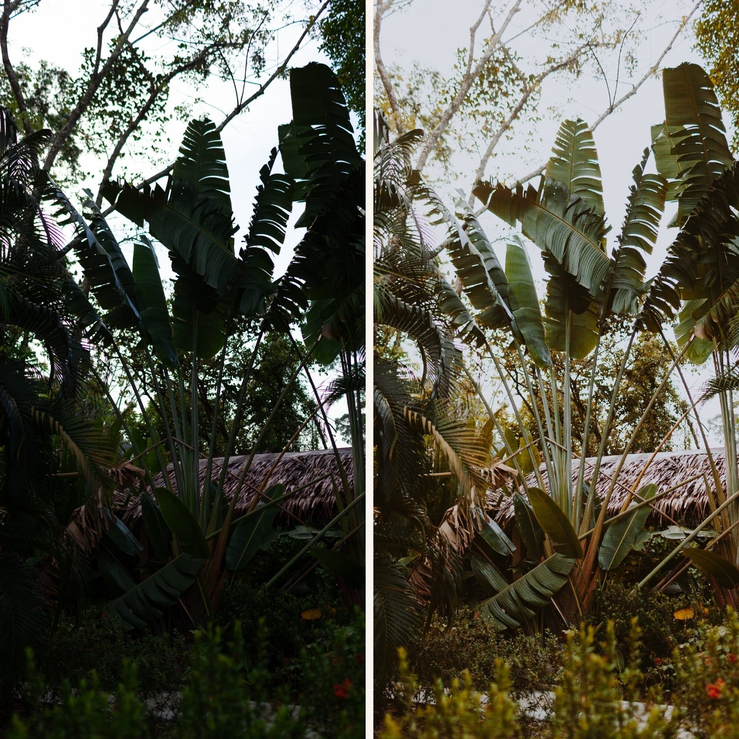
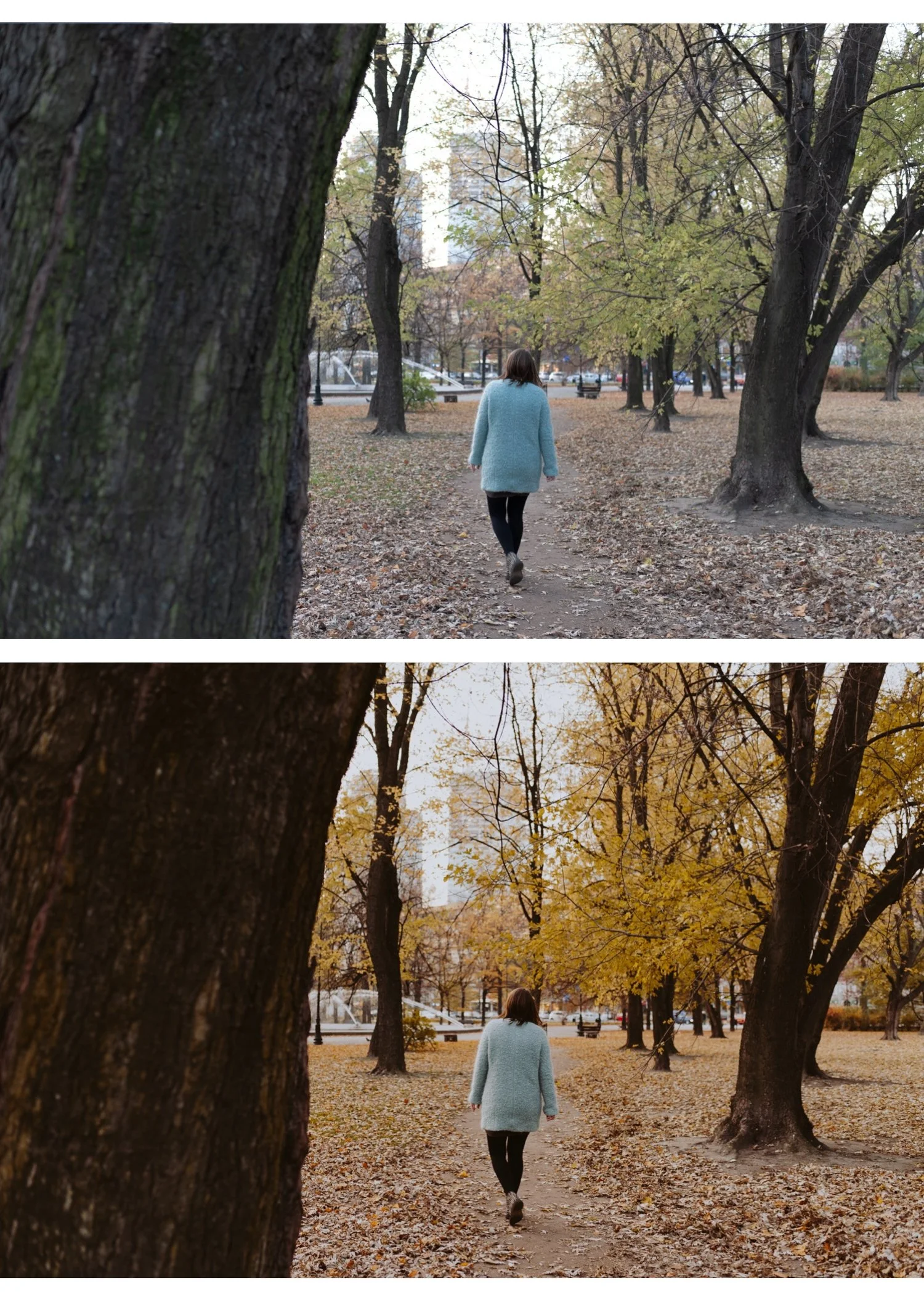
Controlled, muted saturation. Not desaturated — muted. Colors are present but restrained. Stone grey, muted olive green, deep navy, aged warm brown. The vividness of digital color is reduced toward the organic quality of film.
Shadow depth without clipping. The moody quality comes from depth in the shadow range, not from pure black. Shadows are dark and atmospheric but they contain tonal information. The specific warm-grey shadow floor of film photography creates the dimensional quality.
Cool-neutral color temperature. European light — particularly in northern and central Europe — is cooler than Mediterranean or tropical light. The aesthetic references this ambient coolness rather than correcting it toward warmth.
Architectural and textural detail. European photography has stone, aged plaster, wet pavement, iron details. The editing should emphasise texture rather than soften it — unlike portrait work where Clarity goes negative, European street and architectural photography benefits from slight positive Clarity (+3 to +8).
White balance for the moody European aesthetic
White balance is the first decision and the most defining one. Getting this wrong is the most common reason moody European edits look wrong.
Overcast northern European light (Paris, Amsterdam, Copenhagen): 5,500-6,000K, Tint +3 to +5. Keep the cool ambient — do not warm it toward Mediterranean quality.
Blue hour and dusk: 5,200-5,800K, Tint +2 to +4. The blue-grey quality of European blue hour is part of the aesthetic. Resist adding warmth.
Rainy streets: 5,500-5,800K, Tint +3. Wet pavement reflects cool sky light. White balance at neutral-cool, not warm.
Mediterranean European light (Rome, Barcelona, Lisbon): 5,200-5,500K, Tint +4 to +6. Mediterranean light is warmer than northern European light — a slightly warmer white balance is appropriate, but still cooler than a standard warm film look.
Indoor European light (cafes, restaurants, museums): Correct to 3,500-4,500K for warm interior light first, then apply preset. Interior European warmth plus a moody preset creates the specific warm-in-cold quality of being inside a stone building.
The complete moody European workflow
Step 1 — Camera Calibration
Camera Neutral (Canon), Camera Standard (Sony), matching simulation (Fujifilm). Remove the camera's inherent color processing before applying the moody direction.
Step 2 — Tonal foundation
Exposure: 0 to -0.2. The moody European aesthetic is slightly darker than neutral — not underexposed, but not lifted.
Highlights: -35 to -50. Protect the detail in bright stone, sky, and window light.
Blacks: +12 to +18. Less lift than the clean film look. Shadows have depth — but they are not pure black. The lifted floor prevents digital harshness.
Shadows: +8 to +15. Open enough to show texture in the shadow range.
Contrast: -10. Let the Tone Curve handle contrast structure.
Clarity: +3 to +8. Unlike portrait editing, the moody European aesthetic benefits from slight Clarity for stone texture, wet pavement, and architectural detail. Keep below +10 — above this it reads as HDR rather than cinematic.
Step 3 — Tone Curve
The moody European S-curve is more compressed at the top than the standard film look:
Bottom anchor: lift 12-14 units. Point at 25%: nudge down 4 units. Point at 65%: nudge down 5 units. Top anchor: down 8-10 units.
This creates the specific quality of restrained tonal range — no brilliant whites, no pure blacks, controlled depth throughout.
Step 4 — Color calibration
Vibrance: -12 to -18. More reduction than the standard film look. Moody European color is significantly muted.
Green Hue: +8 to +12 toward yellow-olive. European foliage — particularly in autumn and spring — has an organic olive quality. Neon digital green fights the aesthetic completely.
Green Saturation: -18 to -25. Strong reduction. Urban greenery in European streets is architectural, not vivid.
Blue Saturation: -12 to -18. Deeper, less vivid sky and water. Prevents the overly vivid blue quality that makes travel photography look like a postcard.
Blue Hue: +6 to +10 toward purple-blue. Shifts the digital cyan-blue toward a deeper, more cinematic blue-grey quality.
Orange Saturation: -5 to 0. Controlled warmth. Skin should be present but not warm in the conventional film look sense.
Orange Luminance: +10 to +14. Maintains skin presence in the muted palette without adding warmth.
Step 5 — Color Grading
The Color Grading for the moody European aesthetic is more restrained than the moody film look generally:
Shadow Color Grading: Hue 200-215, Saturation 6-10. A very slight cool-blue shadow quality. Keep the saturation low — this should feel like the ambient cool light, not a teal filter.
Highlight Color Grading: Hue 38-42, Saturation 4-6. Very subtle warmth in the highlights — the specific quality of warm stone or interior light against cool sky.
This is the classic restraint of European cinema color: the cool-warm contrast is present but never obvious.
Step 6 — Grain
Amount: 22-28. More grain than the clean film look — the moody European aesthetic references pushed film in challenging light.
Size: 24-30. Slightly coarser than portrait presets.
Roughness: 48-56. High Roughness is essential for organic quality.
Moody European by location
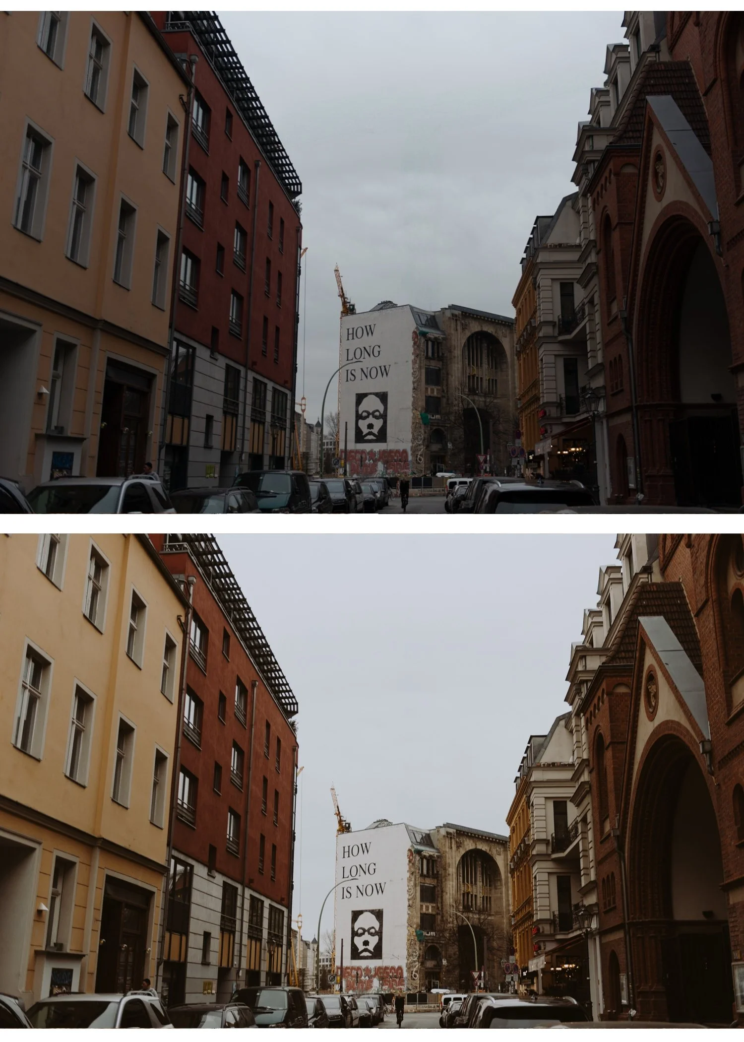
Paris (overcast, grey sky, Haussmann architecture): White balance 5,800K, Tint +4. Blue Saturation -18. Green Saturation -22. Shadow Color Grading Saturation 8. The grey Parisian sky and aged stone benefit from the restrained palette above.
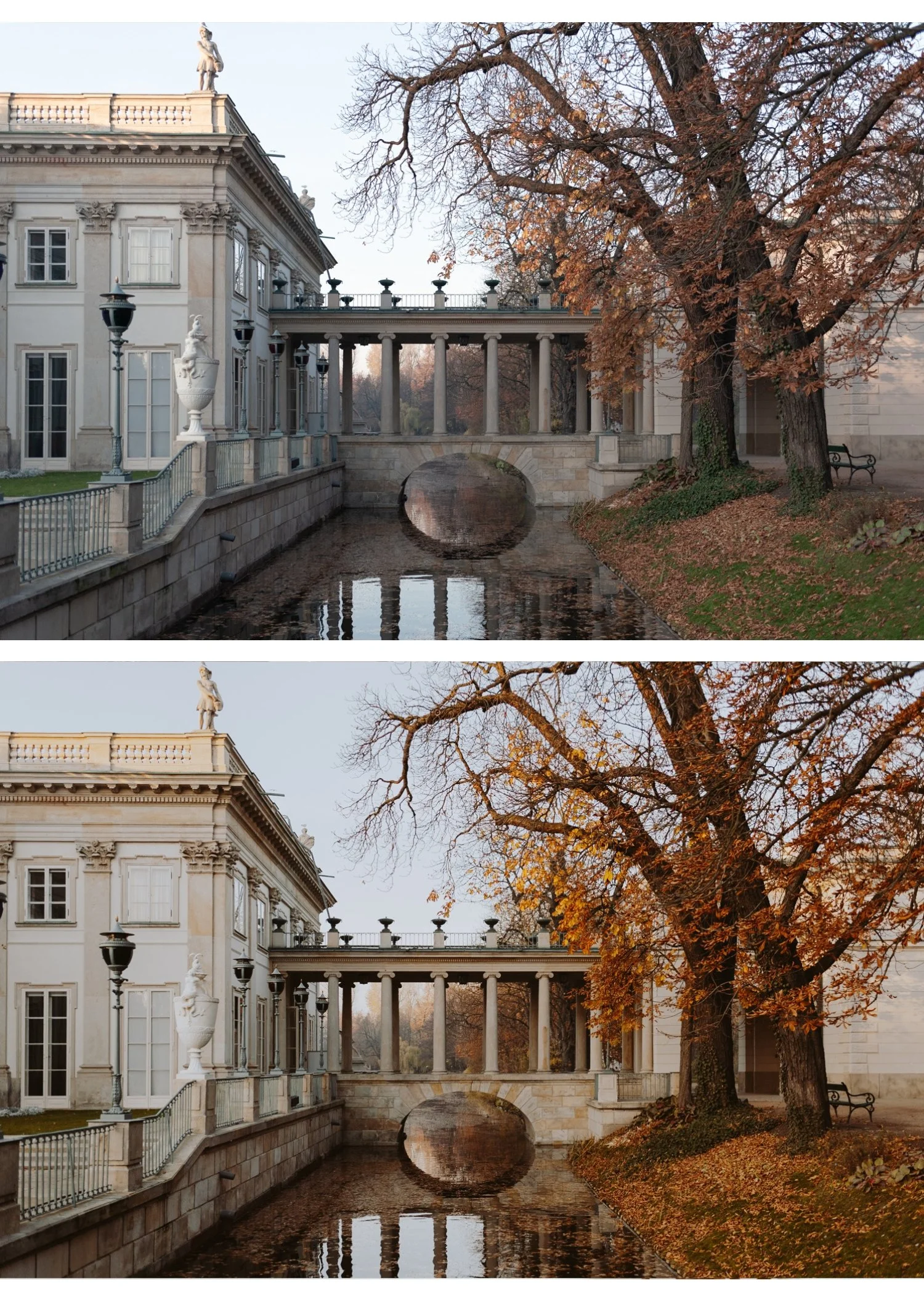
Rome (warm stone, evening light): White balance 5,400K, Tint +5. Orange Luminance +12. Shadow Color Grading Hue 38 Saturation 8 (warmer shadows than northern Europe). The warm stone architecture allows slightly more warmth than northern European locations.
Northern Europe (Amsterdam, Copenhagen, Oslo): White balance 5,800-6,200K, Tint +3. Blue Saturation -20. The blue-grey quality of northern light is the strongest expression of the aesthetic — least warmth, most cool atmosphere.
Eastern Europe (Prague, Budapest, Krakow): White balance 5,500-5,800K, Tint +4. Green Saturation -20, Blue Hue +8. The specific quality of central European architecture — aged stone, iron details, deep history — suits the strongest expression of the moody European look.
Best presets for the moody European aesthetic
M4 Moody Classic — the most balanced moody preset. Controlled shadow depth, restrained saturation, and neutral-cool character suit the European aesthetic directly. The most versatile starting point.
M5 Warm Dark — for warmer European locations (Rome, Lisbon, Barcelona) and golden hour scenes. More warmth in the shadow range than M4.
A9 Urban Neutral — for cleaner, more editorial European street photography. Less moody but with the cool-neutral urban character.
V2 Clean Fade — for a more subtle European quality. Less dramatic than M4 but retains the muted, restrained aesthetic.
Explore the Moody Film Archive — $27 →
Or get every preset in the collection including the complete Moody Film Archive for $0.68 per preset.
Common mistakes in moody European editing
Crushing blacks. Pure black looks digital, not cinematic. The moody quality comes from lifted, warm-grey shadows with depth — not from removing all shadow detail.
Overusing teal shadows. Heavy teal-and-orange Color Grading is a generic cinematic filter, not the moody European aesthetic. Keep Shadow Color Grading Saturation below 10.
Making the photo too dark. Moody does not mean underexposed. The exposure baseline is neutral to -0.2, not -0.5 or -1.0. Darkness should come from the Tone Curve compression and Blacks value, not from exposure reduction.
Excessive Dehaze. Dehaze adds a harsh, HDR quality to atmospheric photography. For the moody European aesthetic, Dehaze should be 0 or maximum +5. Above this the organic quality is lost.
Positive Clarity too high. Above +10, Clarity creates the HDR micro-contrast quality that is the opposite of the cinematic aesthetic. Keep below +8 even for architectural photography.
FAQ
Does the moody European look work outside of Europe?
Yes — the aesthetic is defined by light quality and editing approach, not geography. Overcast urban environments anywhere, architectural photography in grey or cool light, and rainy street photography all suit the moody European direction regardless of location.
Why does my moody European edit look muddy instead of atmospheric?
Two causes: Blacks too low (going toward pure black instead of lifted grey-black) or Blue and Green Saturation not reduced enough (digital color reading through the muted palette). Check Blacks are at +12 to +18 and Blue Saturation is at -12 to -18.
Can I use the moody European approach for portrait photography in Europe?
Yes with modifications. Reduce Clarity to -8 to -10 for portraits (the +3 to +8 value is for architectural and street work). Increase Orange Luminance to +14 to +16. The moody European palette works for portraits but requires the portrait-specific adjustments to prevent skin from going grey.