How to Get the Film Look in Lightroom (Step-by-Step Workflow)
How to Get the Film Look in Lightroom (Step-by-Step Workflow)
Most photographers do not struggle with getting the film look because they lack taste.
They struggle because digital files are technically unforgiving. Highlights clip fast. Skin tones shift. Shadows get muddy. And the more sliders you push, the more digital the result feels.
A real film look is not a filter you drop on top. It is a repeatable workflow that makes your edits feel cohesive, calm, and finished. This guide gives you that workflow from start to finish.
What Makes a Photo Look Like Film?
Before touching any slider, it helps to understand what film actually does that digital does not.
Film responds to light non-linearly. Highlights compress gradually instead of clipping hard. Shadows retain texture instead of going pure black. Colors are slightly desaturated and shifted toward specific hue ranges depending on the film stock. And there is a faint, organic grain throughout.
Digital cameras do the opposite. They capture linearly. Highlights clip at a hard boundary. Shadows drop cleanly to black. Colors are accurate but not particularly pleasing.
Getting the film look in Lightroom means recreating those non-linear film characteristics deliberately, one adjustment at a time.
What You Need Before You Start
The film look starts with light, not editing. If you begin with a badly exposed image or a scene with flat, ugly light, no workflow will save it.
Before opening Lightroom, make sure:
You are editing a RAW file, not a compressed JPEG
The image is not heavily underexposed or overexposed
White balance is not wildly off
You are not trying to rescue bad light with aggressive color grading
Film looks fall apart when used to compensate for problems that should have been solved in camera.
Step 1: Set Exposure Before Anything Else
Exposure is the foundation of every other adjustment. If it is wrong, every slider you touch after it will be working against a flawed base.
Adjust Exposure until the image feels open and believable, not dramatic. Pull Highlights slightly if the bright areas are clipping. Lift Shadows only enough to reveal detail in dark areas without flattening the depth.
The goal at this stage is not a finished look. It is a clean, balanced starting point where you can see what the light in the image actually is.
Step 2: Set a Stable White Balance
Film tones feel natural because the temperature is stable and intentional. Digital files often have a slight color cast from the camera's auto white balance, which makes edits feel clinical even after other adjustments.
How to set it:
Use the White Balance picker on a neutral area if one exists in the frame
Then adjust Temperature and Tint by feel
Use skin as your reference point, not walls, skies, or backgrounds
The rule: if skin looks alive and believable, the overall edit will feel filmic even if the background is imperfect. Skin is the most sensitive tonal indicator in a photo.
Step 3: Build Film Contrast Without Harshness
The most common mistake when trying to get the film look is adding global Contrast. The result is an image that looks punchy but not filmic. Film contrast is shaped, not added.
Correct approach:
Lower Blacks slightly to add depth without crushing shadows
Add a small amount of Contrast if needed
Go to the Tone Curve and pull the top-right anchor point down slightly to soften highlights
Add a subtle bend just below it to create a gradual roll-off
The Tone Curve is where the film feel actually lives. The Contrast slider is blunt. The Curve is precise. For a detailed breakdown of exactly how to use the Tone Curve for this purpose, read the Tone Curve guide on this site.
Step 4: Remove the Digital Feel
After exposure and contrast are set, most images will still have a quality that reads as digital. This comes from several overlapping factors:
Whites that feel hard and sterile
Colors that are too clean or too saturated
Shadows that look technically correct rather than naturally layered
Micro-contrast from Clarity or Texture that makes edges feel sharp
Fix these in order:
Reduce Texture slightly (-5 to -10)
Reduce Clarity slightly (-5 to -10)
Reduce Vibrance slightly (-5 to -15)
These are small moves. The goal is to remove the clinical edge that digital files have by default, not to make the image soft or blurry.
Step 5: Control Skin Tones in HSL
Skin tones are the difference between a nice-looking edit and a professional one. If skin shifts between photos, the entire gallery loses coherence.
In the HSL panel:
Reduce Orange Saturation slightly if skin reads too loud or warm (-5 to -20)
Shift Orange Hue subtly toward yellow or red depending on skin tone
Reduce Red Saturation slightly if there is a pink or sunburn quality to skin
Avoid large global Temperature changes after skin is already balanced
If you are constantly fighting skin tones on every image, the base preset is not calibrated for your shooting conditions. That is a workflow problem, not a per-image problem.
Step 6: Add Grain With Intention
Grain is not decoration. It exists in the film look because it is physically part of how film captures light. In Lightroom, it breaks the digital perfection that makes images look processed.
Settings to start with:
Amount: 15 to 25
Size: 20 to 30 (smaller grain is more subtle)
Roughness: 40 to 50
Keep grain consistent across all images in a set. If you add grain to one photo at 30 and none to the next, the gallery will not hold together.
Step 7: Edit the Full Shoot Consistently
A film look is not judged on one image. It is judged on twenty. One great edit surrounded by inconsistent ones does not read as a film aesthetic. It reads as a lucky shot.
Consistency method:
Edit one reference photo first using the full workflow above
Sync basic settings across the rest of the set
Adjust Exposure individually per image (small corrections only)
Keep White Balance within a narrow range across the set
Keep grain consistent throughout
Never judge consistency one image at a time. Always review the gallery in grid view before calling the edit finished.
The Complete Film Look Workflow at a Glance
| Step | Panel | What to adjust |
|---|---|---|
| 1 | Basic | Exposure, Highlights, Shadows |
| 2 | Basic | Temperature, Tint |
| 3 | Basic + Tone Curve | Blacks, Contrast, highlight roll-off on Curve |
| 4 | Basic + Detail | Texture, Clarity, Vibrance |
| 5 | HSL | Orange and Red Saturation, Orange Hue |
| 6 | Effects | Grain Amount, Size, Roughness |
| 7 | Library | Sync, per-image Exposure correction, grid review |
Choosing the Right Film Direction
Once your workflow is stable, the aesthetic becomes a choice. Different film stocks had distinct characteristics, and Lightroom presets built around those characteristics give you a reliable starting point for each direction.
| Film direction | Visual characteristics | Best for |
|---|---|---|
| Bright and clean | Lifted shadows, soft contrast, neutral tones | Portraits, lifestyle, travel |
| Moody and atmospheric | Deep shadows, controlled highlights, muted color | Street, architecture, low light |
| Warm and creamy | Warm midtones, soft skin, gentle contrast | Portraits, golden hour, weddings |
| Punchy vintage color | Saturated primaries, high contrast, color separation | Travel, outdoor, documentary |
| Timeless black and white | Strong tonal range, film grain, silver halide quality | Portrait, street, editorial |
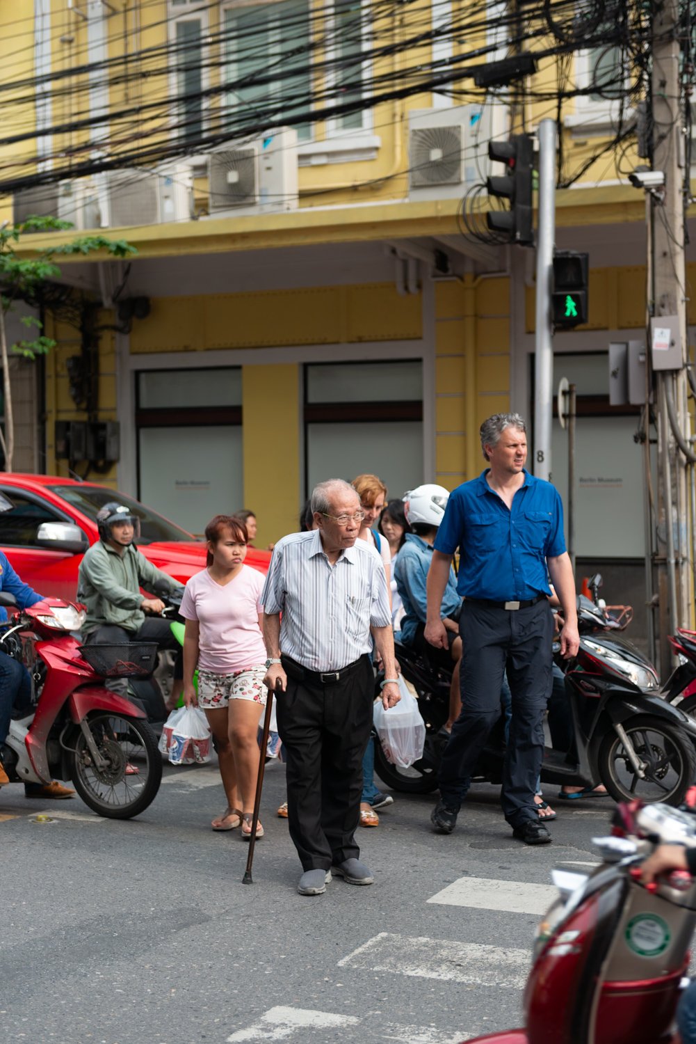
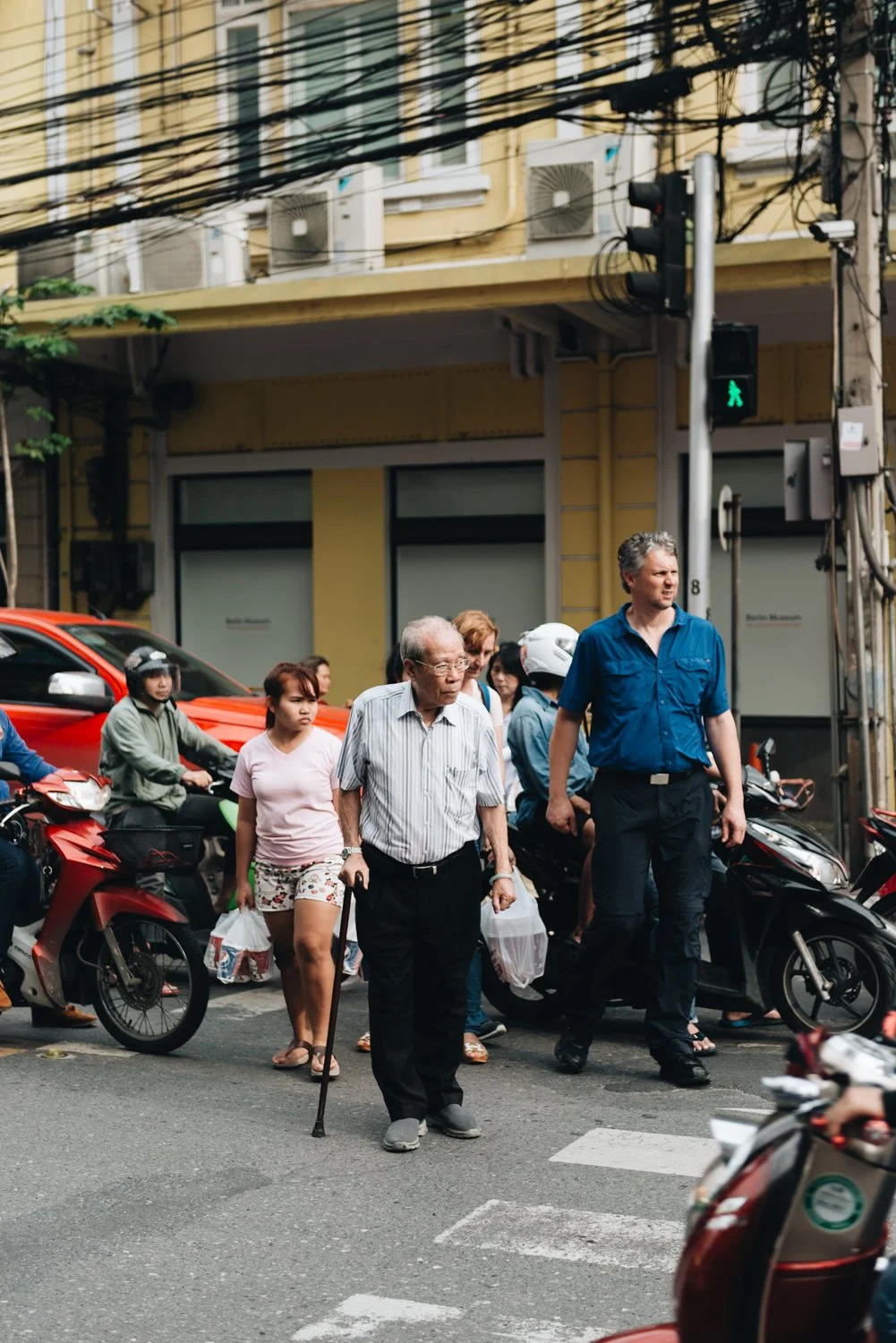
Why Travel Shoots Break the Film Look Fastest
Travel galleries are the hardest test for any editing workflow. Bright daylight, open shade, indoor tungsten, golden hour, and night scenes can all occur in the same day. If your preset was not calibrated for outdoor light variation, it will produce inconsistent results across the gallery.
The most common failure points in travel edits:
Highlights blowing out in midday sun
Greens shifting between jungle, olive, and neon in the same gallery
Indoor shots going orange from tungsten light
White Balance drifting across different parts of the day
If travel photography is your main subject, editing in lighting groups rather than chronological order is the single most effective fix.
The Studio Archive
If you want a complete foundation for the film look across every shooting condition, the Studio Archive contains 130 presets covering every major film direction: analog, moody, bright and clean, warm portrait, vintage color, and black and white.
Each preset is built on a calibrated tonal base with soft highlight behavior, controlled grain, and stable skin tones, so you spend less time correcting and more time editing.
FAQ
Do I need Lightroom presets to get the film look?
No. You can build the film look manually using the workflow in this guide. Presets speed up the process by giving you a calibrated starting point, but they are not required. Understanding the underlying adjustments is more important than any specific preset.
Why do my film edits still look fake after following these steps?
Usually one of three things: contrast is too heavy, skin tones are unstable, or grain is too large and rough. Check each of these individually. Also check that you are not stacking warmth in White Balance, HSL Orange, and Color Grading simultaneously.
What is the single most important adjustment for the film look?
Highlight control. If highlights clip hard, the edit will always feel digital regardless of what else you do. Soft highlight roll-off via the Tone Curve is the fastest way to shift an image from digital to filmic.
How do I stop my edits from looking inconsistent across a shoot?
Edit a reference photo first, sync settings to the rest of the set, then adjust Exposure individually per image. Never sync Exposure. Review the full gallery in grid view before finishing.
Can I use this workflow on iPhone RAW files in Lightroom Mobile?
Yes. Lightroom Mobile supports the same panel structure as Lightroom Classic. The Tone Curve, HSL, and Effects panels are all available. RAW files from iPhone give you more latitude than JPEGs, so shoot in RAW mode if your device supports it.