Lightroom Mobile Editing Guide (Complete 2026 Guide)
Lightroom Mobile Film Editing Guide — Complete 2026 Guide
Lightroom Mobile is the most powerful free photo editing app available. In 2026 it supports RAW files, full tone curve control, AI masking, color grading, and preset application — everything a professional photographer needs, on a phone.
Most photographers use 10% of what Lightroom Mobile can do. They apply a preset, adjust exposure, and export. The results are inconsistent because the foundation is wrong.
This guide covers the complete Lightroom Mobile film editing workflow — from understanding the tools to building a consistent editing system that produces professional results every time.
Understanding Lightroom Mobile in 2026
Lightroom Mobile is not a simplified version of Lightroom Classic. It is a full photo editing application optimized for touch input with the same editing engine as the desktop version.
Every adjustment you make in Lightroom Mobile — tone curve, HSL, color grading, grain — uses the same processing as Lightroom on desktop. The results are identical when exported at the same settings.
What Lightroom Mobile has:
Basic panel — exposure, contrast, highlights, shadows, whites, blacks
Tone Curve — parametric and point curve with individual RGB channels
Color Mix (HSL) — hue, saturation, and luminance per color channel
Color Grading — shadow, midtone, and highlight toning
Detail panel — sharpening and noise reduction
Effects — grain and vignette
Optics — lens corrections and chromatic aberration
Geometry — perspective corrections
Masking — AI-powered subject, sky, background, and object masking
Presets — full DNG and synced XMP preset support
What Lightroom Mobile does differently from desktop:
Batch export options are simpler
File organization is less detailed than Lightroom Classic catalogs
Some masking tools have slightly reduced controls
Large preset libraries can feel slower to browse
For a full breakdown: Lightroom Mobile vs Desktop — Full Comparison
Setting up Lightroom Mobile correctly
Before editing, three setup steps make everything that follows more consistent.
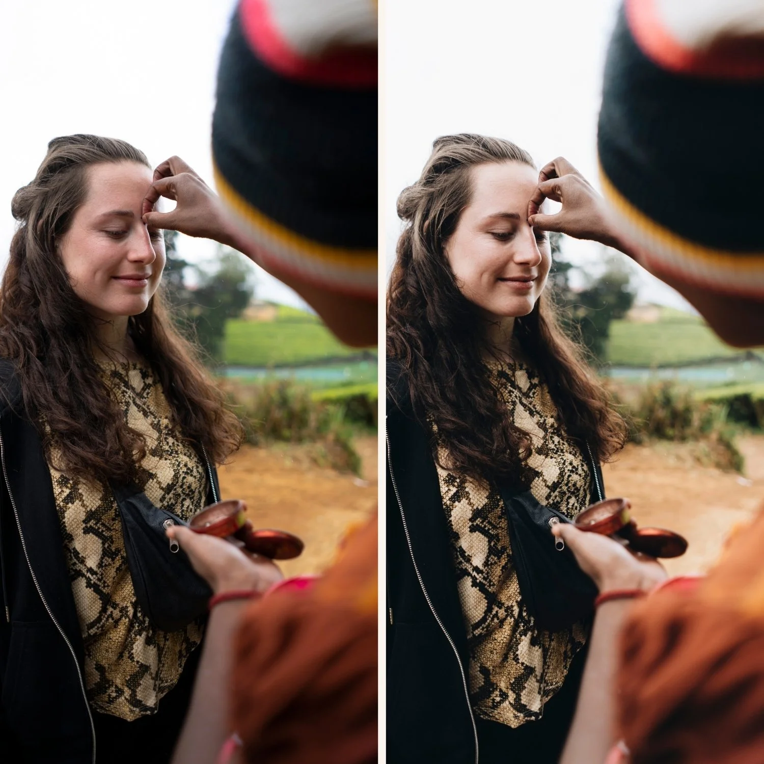
Step 1 — Set your default camera profile. Every RAW file from your camera or iPhone is processed by Lightroom Mobile using a camera profile. The default is usually Adobe Color or Adobe Standard. For film editing, switch to Adobe Neutral — it gives you a flatter, more natural starting point that responds better to film presets.
Go to any photo in Develop. Scroll to the bottom of the editing panel to find Camera Calibration. Change the Profile dropdown from Adobe Color to Adobe Neutral.
Step 2 — Reduce default sharpening. Lightroom Mobile applies default Sharpening at 40 to all photos. For film preset editing, this adds digital crispness that works against the organic film quality. Reduce Sharpening to 20-25 as your baseline.
Go to Detail panel. Reduce Sharpening Amount to 20-25.
Step 3 — Install your presets. Film presets are the foundation of a consistent mobile editing system. Install them before starting your workflow.
Full installation guides:
The complete film editing workflow for mobile
Most inconsistent editing comes from applying steps in the wrong order. The correct order matters — each step builds on the foundation of the previous one.
Step 1 — Fix exposure first
Before touching anything else, set the exposure correctly. A preset applied to an underexposed photo looks different from the same preset on a correctly exposed photo — even if you add exposure after. The reason is that Lightroom's adjustments are applied in a specific processing order, and exposure affects how every other adjustment renders.
Correct exposure: The brightest areas of the photo should be bright without clipping. The darkest areas should have visible detail unless intentionally dark.
Use the histogram in the top right of the editing panel. You want the histogram data to sit within the frame on both sides — not pushed hard to the left (underexposed) or to the right (overexposed).
Typical exposure correction range: -1.5 to +1.5 stops from the default.
Step 2 — Set white balance
Set white balance before applying any preset. This is the single most important setup step for consistent results.
Wrong white balance stacks with preset color adjustments and creates unpredictable results. Orange indoor lighting plus a warm film preset creates very orange photos. Correct white balance first, then the preset adds its intended color quality.
Quick white balance method: Tap the eyedropper in the Color panel. Tap on a neutral area in your photo — white wall, grey clothing, white ceiling. Lightroom sets white balance automatically.
Manual method:
Outdoor daylight: Temperature 5500, Tint 0
Indoor tungsten: Temperature 3000-3200, Tint +10
Overcast outdoor: Temperature 6000-6500, Tint +5
Window light: Temperature 4800-5200, Tint +5
Full guide: How to Fix White Balance in Lightroom
Step 3 — Apply your preset
With correct exposure and white balance set, apply your film preset. It should look close to the intended result immediately — only minor fine-tuning should be needed.
Tap Presets at the bottom of the editing panel. Browse by folder. Tap to apply. The preview updates instantly.
Choosing the right preset for your lighting: Film presets are calibrated for specific lighting conditions. Applying a golden hour preset to an overcast photo creates warm color in cold light — which looks wrong. Match the preset to the lighting:
Bright outdoor daylight: A1, A2, C1, or C5
Warm golden hour: A4, C7, M5, or E7
Overcast outdoor: A6, E4, or any neutral preset
Indoor natural light: A6, E2, or E6
Low light and moody: M4, M5, or E8
Step 4 — Fine-tune with the preset amount slider
After applying the preset, a slider appears at the bottom of the screen. This controls the preset strength from 0% to 100%.
For most film presets on mobile photos, 70-85% looks more natural than 100%. iPhone camera processing already adds contrast and saturation — a full-strength film preset can push this too far.
Start at 80% and adjust from there.
Full guide: Lightroom Preset Amount Slider — How to Use It
Step 5 — Adjust highlights and shadows
After the preset, check two things:
Highlights: Pull Highlights to -20 to -35 if bright areas are getting close to clipping. Outdoor photos and photos with bright windows almost always need this.
Shadows: Lift Shadows by +10 to +20 if shadow areas look too dark or lost detail. For dark skin tones, lift Blacks by +10 to +20 additionally.
Step 6 — Check skin tones (portrait photography)
For photos with people, open the Color Mix panel. Check the Orange channel:
Orange Luminance: should be +10 to +20 for natural skin brightness
Orange Saturation: should be 0 to +10 — if skin looks orange, reduce to -5 or -10
Full guide: Best Lightroom Settings for Skin Tones
Step 7 — Fine-tune color with HSL
The Color Mix panel controls individual color channels. For film editing, two adjustments are consistently useful:
Greens: Shift Green Hue toward yellow (+8 to +12) to move digital neon green toward organic film green. Reduce Green Saturation by -10 to -15 to remove digital oversaturation.
Blues: Enhance Blue Saturation by +5 to +10 for deeper, richer sky and water color. Shift Blue Hue toward cyan (+5) for the specific quality of film color science.
Step 8 — Add or adjust grain
Most film presets include grain. Check that the grain level is appropriate for your photo. Very dark or very bright photos may need the grain adjusted.
In Effects panel: Amount 15-25, Size 20-30, Roughness 40-50 for most film looks.
Full guide: Film Grain Lightroom Preset — Complete Guide
Step 9 — Batch similar photos
After editing your reference photo, apply the same settings to similar photos from the same shoot.
Long press a photo to enter selection mode. Select all similar photos. Tap the three dots, tap Paste Settings. The settings from your edited photo apply to every selected photo.
Then open each photo individually and adjust only exposure and white balance — the preset and color work carry over consistently.
Full guide:How to Batch Edit in Lightroom Mobile
Step 10 — Export
Tap the share icon. Select Export As for custom settings.
For Instagram: JPEG, 1080 x 1350px, quality 80%, sRGB
For sharing: JPEG, maximum resolution, quality 80%, sRGB
For printing: JPEG, maximum resolution, quality 95%, sRGB, 300 DPI
Full guides:
Understanding each editing tool
The Basic panel
The foundation of every edit. Work through these sliders in order:
Exposure — overall brightness. Fix this first before touching anything else.
Contrast — the difference between lights and darks. Film looks use negative contrast (-10 to -25) for softer tonal transitions.
Highlights — controls the brightest areas specifically. Pull back for outdoor photos (-25 to -40).
Shadows — controls the darkest areas specifically. Lift for more shadow detail (+10 to +25).
Whites — controls the absolute brightest whites. Usually pulled slightly back (-10 to -20) for film quality.
Blacks — controls the absolute darkest blacks. Lifted significantly for film look (+15 to +30). This is the most important single slider for the film aesthetic.
The Tone Curve
The tone curve controls the same tonal qualities as the Basic panel but with more precision and smoother transitions.
For the film look on mobile, the tone curve does two things the Basic panel cannot:
Lift the black point. Drag the bottom-left corner anchor point upward 15-20 units. This creates the lifted, warm shadow quality of film that is different from simply lifting Blacks in the Basic panel.
Soften the highlights. Add an anchor point at 75-80% on the horizontal axis and drag down 5-8 units. This creates the soft highlight roll-off of film — highlights glow rather than clip.
The RGB channels (tap the dropdown at the top of the Tone Curve) let you add color to specific tonal ranges — the same technique used in professional color grading.
Full guide: How to Use the Tone Curve in Lightroom
Color Mix (HSL)
Three tabs control each color channel individually.
Hue — shifts the color direction. Orange toward yellow for more natural skin. Green toward yellow for organic rather than digital green.
Saturation — controls the vividness of each color. Reduce Green and Blue for film color. Keep Orange natural.
Luminance — controls the brightness of each color independently. Lift Orange for natural skin brightening. Lower Blue for deeper sky and water.
Color Grading
Color Grading adds specific color tones to shadows, midtones, and highlights independently — the technique used in cinema color grading.
For film looks: warm amber in shadows (hue 25-40, saturation 10-20) creates the warm shadow quality of classic film stocks. Keep saturation subtle — the effect should be felt, not seen.
Masking
Lightroom Mobile's AI masking lets you apply adjustments to specific parts of a photo.
Subject mask — selects people automatically. Useful for adjusting skin tone independently of the background.
Sky mask — selects sky automatically. Useful for pulling back sky brightness or adding blue saturation specifically to the sky.
Luminance range mask — selects a specific brightness range. Useful for targeting just the shadows or just the highlights.
Film editing for specific scenarios
Travel photography on mobile
Travel photos vary enormously in lighting — bright outdoor sun, overcast days, indoor scenes, golden hour. The solution is a preset system rather than a single preset.
Use A1 or C1 for bright outdoor daylight. Switch to A4 or C7 for warm late-day light. Use E4 or A6 for overcast and neutral conditions. The consistent color philosophy across series means photos from the same trip look related even when different presets are used.
For the full workflow: Lightroom Mobile Editing Workflow for Travel
Instagram content editing
For Instagram, cohesion matters more than individual photo quality. A consistent visual identity across 12-20 photos looks more professional than individual stunning shots with no consistent editing direction.
Choose one base preset. Create 2-3 variations of that preset for different lighting conditions. Apply consistently across every post. The feed builds a visual identity.
For Instagram-specific guidance: Editing Instagram Photos in Lightroom Mobile
Portrait photography on mobile
For portraits, skin tone rendering is the priority. After applying your preset: check Orange Luminance (+10-15), check Clarity is negative (-10 to -15), and verify white balance is not pushing toward orange.
For iPhone portraits: disable Smart HDR in iPhone Settings before shooting. Smart HDR creates a flatter base image that works better with film presets.
For the full portrait guide:Best Lightroom Presets for Portrait Photography 2026
Common mobile editing problems
Presets look different on every photo Almost always caused by inconsistent white balance or exposure before the preset is applied. Fix both before applying the preset. Full guide: Why Do Presets Look Different on Mobile?
Presets not showing in Lightroom Mobile Three possible causes: DNG files not imported correctly, presets not synced from desktop, or app needs updating. Full guide: Why Aren't My Presets Showing in Lightroom Mobile?
iPhone photos looking too sharp or processed after editing iPhone adds aggressive sharpening by default. Reduce Sharpening in the Detail panel to 15-20 and add Clarity at -10 before applying any preset.
Photos looking inconsistent across a gallery Usually caused by applying different preset amounts or not correcting white balance per photo. Set a consistent workflow and apply it to every photo in the same sequence.
Building a consistent mobile editing identity
The photographers whose work looks consistently professional are not doing more complex editing than everyone else. They are doing simpler editing, more consistently.
Choose one direction. Clean analog or moody cinematic. Golden hour warm or muted editorial. Pick one and commit. Switching preset packs weekly creates visual inconsistency.
Build a small system. Three to five presets covering your common lighting scenarios is more powerful than fifty presets applied randomly. The Analog Film Archive gives you ten calibrated variations on one color philosophy — enough to cover every lighting condition without visual inconsistency.
Fix the foundation before applying style. Exposure and white balance first. Always. Every time. This single habit produces more improvement in editing consistency than any preset purchase.
Less editing, not more. The film look comes from what you remove — digital harshness, oversaturation, harsh contrast — not from what you add. Negative clarity, lifted blacks, reduced vibrance. The restraint is the technique.
The Studio Archive — complete mobile preset system
The Studio Archive gives you 130+ presets for every film style — all calibrated for mobile and desktop use, all including DNG files for direct Lightroom Mobile installation.
One download. Every film look you will ever need. $0.68 per preset.
Free film preset to start today
Download the free A6 preset and apply the workflow above to your next ten photos. Set exposure. Set white balance. Apply preset at 80%. Fine-tune highlights and shadows. Batch the similar shots. Export.
That ten-minute workflow produces more consistent results than most photographers achieve in an hour of random editing.
FAQ
Is Lightroom Mobile good enough for professional photography?
For most professional photography delivered digitally — portraits, lifestyle, travel, social media — yes. The editing quality matches desktop when used correctly. For maximum precision, batch export control, and large catalog management, desktop has advantages.
Do I need a subscription to use Lightroom Mobile?
The Lightroom Mobile app is free to download with basic editing features available without subscription. Advanced features including some selective adjustments require Creative Cloud. Preset installation and application is free.
Can I use the same presets on mobile and desktop?
Yes — preset packs include both DNG files (for mobile direct install) and XMP files (for desktop). The result is the same on both platforms.
How many presets should I have on mobile?
Three to five core presets covering your most common scenarios. More than ten presets makes the workflow slower and more inconsistent. Build a small, calibrated system rather than a large random collection.
What is the best film preset for Lightroom Mobile?
It depends on your photography style and lighting. The A6 preset is the most versatile starting point — works across portrait, travel, and lifestyle in most natural lighting conditions. Download it free and test it on your own photos before buying anything.
Why do my mobile edits look different when I open them on desktop?
Lightroom Mobile and Lightroom Classic use slightly different camera profiles for some RAW formats. The edit data is the same but the rendering differs slightly. Adjust exposure and white balance as needed on desktop after syncing.
All Lightroom Mobile guides
Installation:
Workflow:
Editing technique:
Export:
Comparison:
Presets: